Being a great fan of comic books, I always loved the visual identities used for some famous characters. Most super-heroes logos are like a incorporation of many aspects of the characters and their superpowers. I always liked Hulk logo as everytime I look at it I always remember his famous quote “Hulk Smash”.
This is a intermediary tutorial, so it’s not as long and it’s not as hard as my usual tutorials. As always, a tablet will be pretty handy here, but in case of not having one, you still can do it with a mouse, you’re just going to have a bit more of difficulty on some parts. Anyway, hope you guys have fun and understand the simple dinamics behind this logotype formation.
Step 1
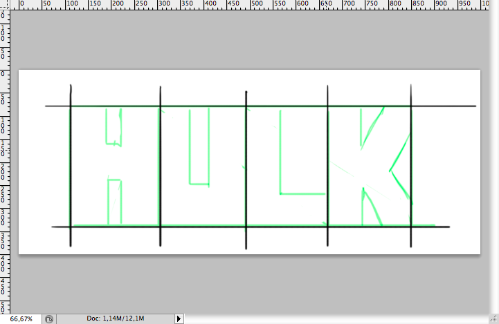
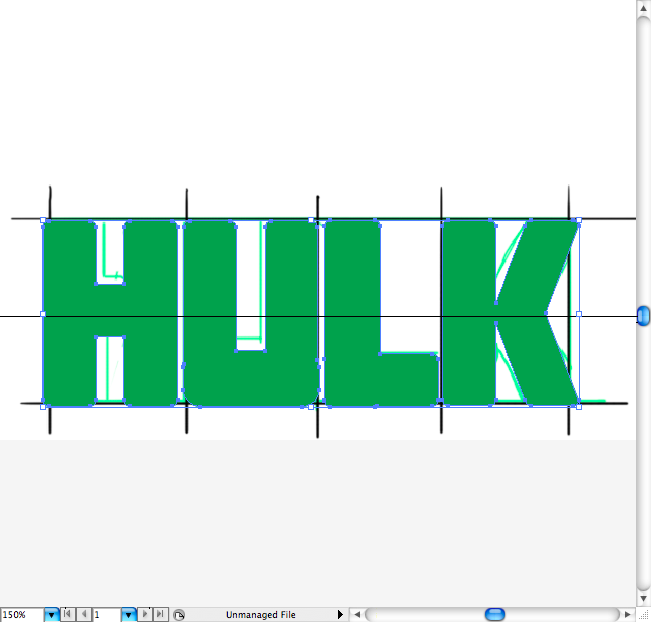
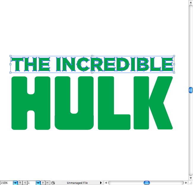
First I did a really simple rough, making 2 lines and 4 columns to simbolyze the letter tracking. Then just draw the 4 letters on a really squared version, tryin to make then quite similar.
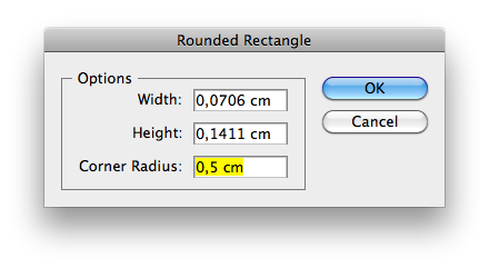
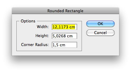
Put it on Illustrator and use the round rectangle tool with a 0,5 cm radius to create the letter shapes. I rather use some smoother shapes as this, than just simple and sharp rectangles, because it looks less flat.
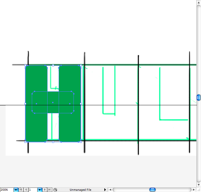
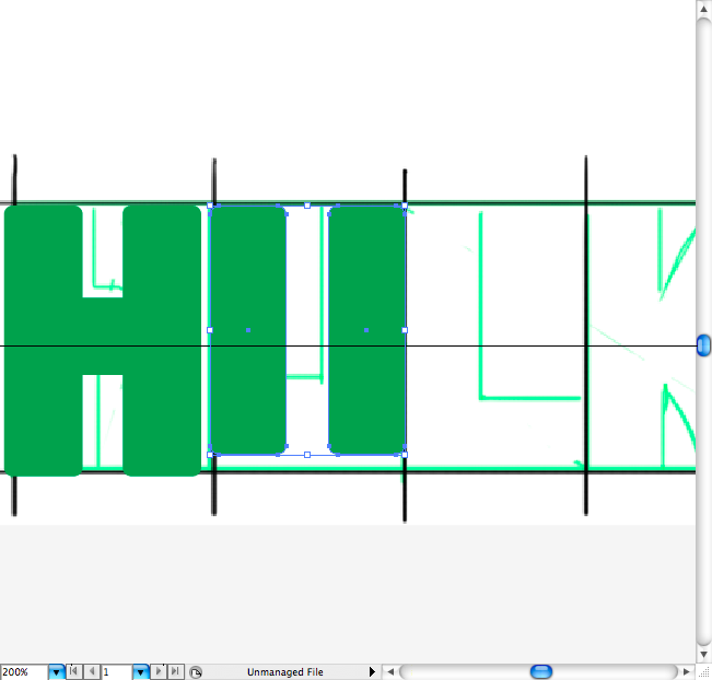
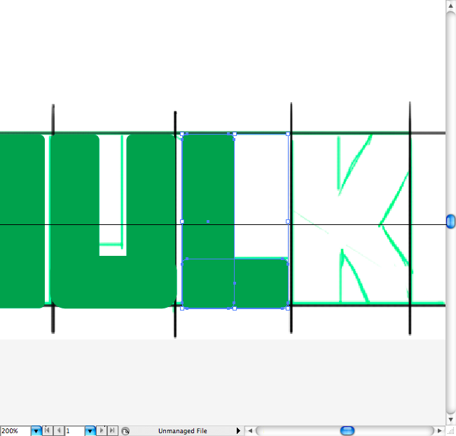
After you done all the letters, you should select them all use the pathfinder option called Unite in order to make all pieces just one.
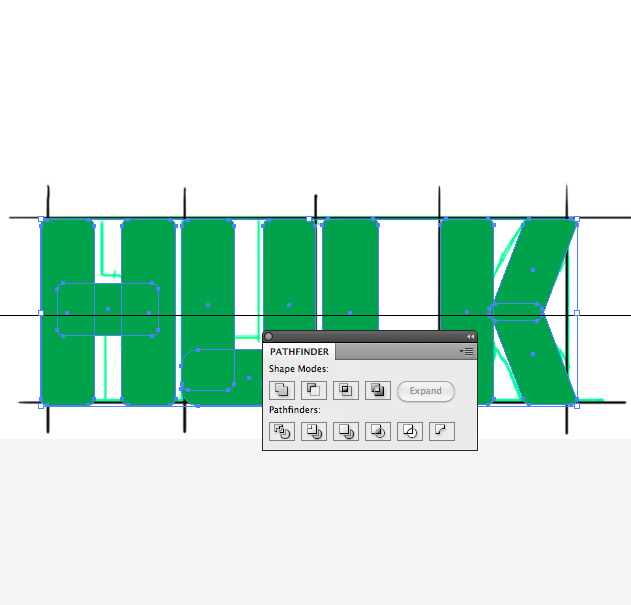
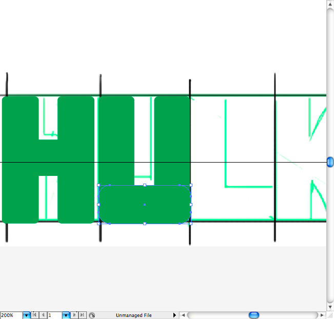
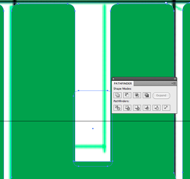
You can also adjust some corner by creating another round rectangles over it and using the pathfinder option called Minus Front, this will get the type a all round appearance.
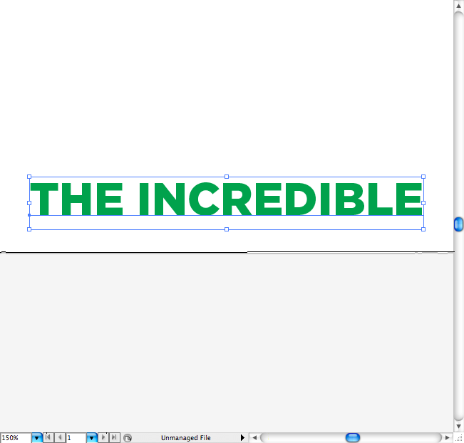
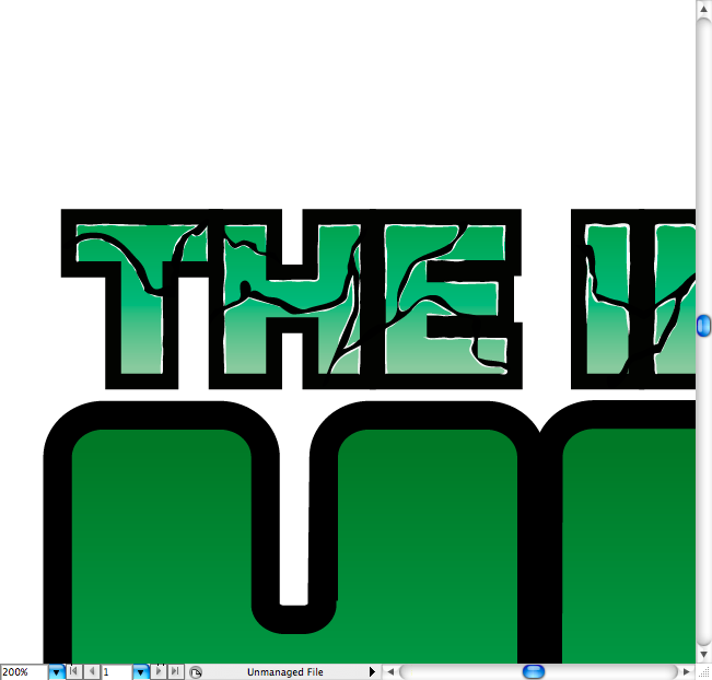
I sued a sans serf typeface for the lettering, this one it’s called Gotham Black, but you can pretty much a use a similar sans serif heavy typeface.
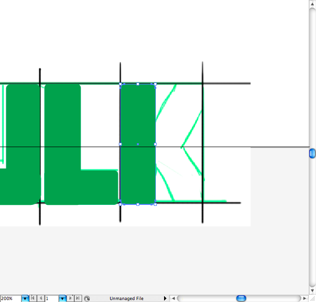
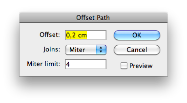
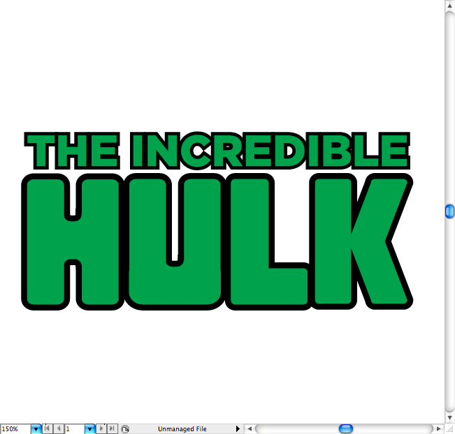
Outline it (command + shift + O / ctrl +shift + O), adjust the tracking between the letters as we’re going to apply a offset path and so they should not overlap each other. Ok,now go to Object > Path > Offset path and set the offset to 0,2 cm.
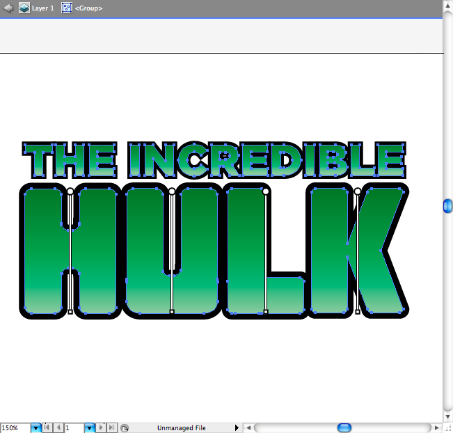
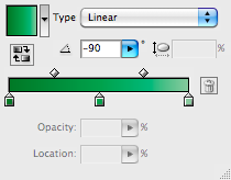
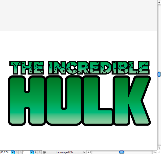
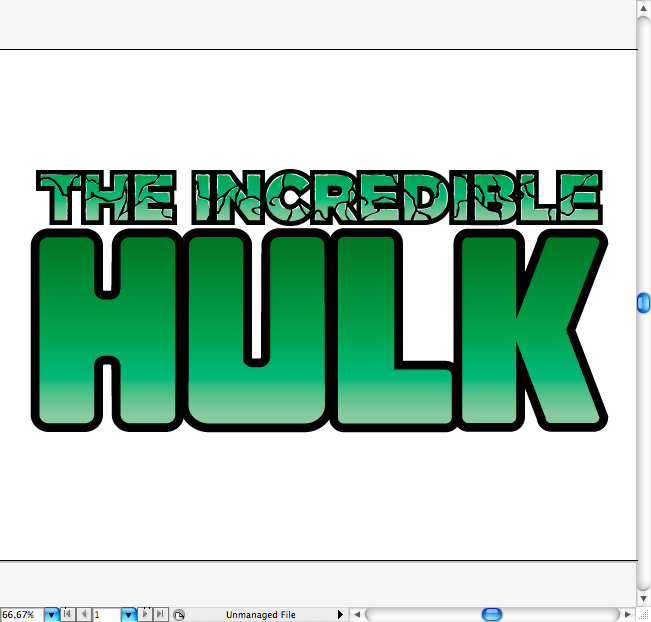
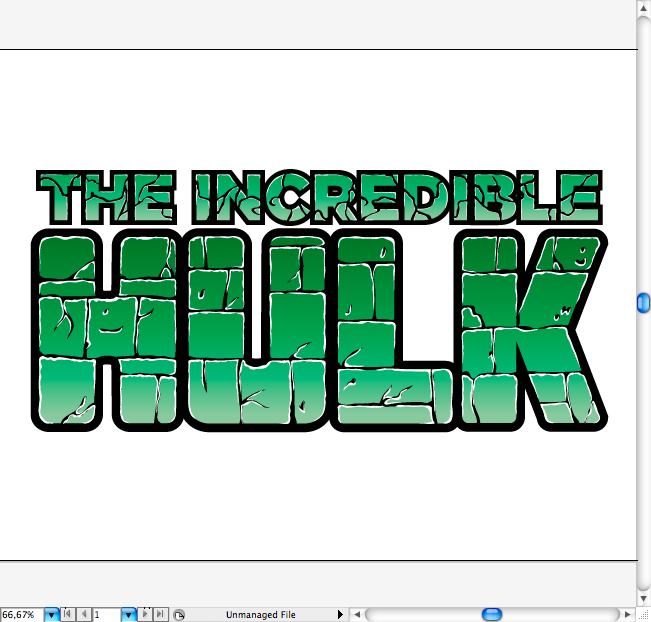
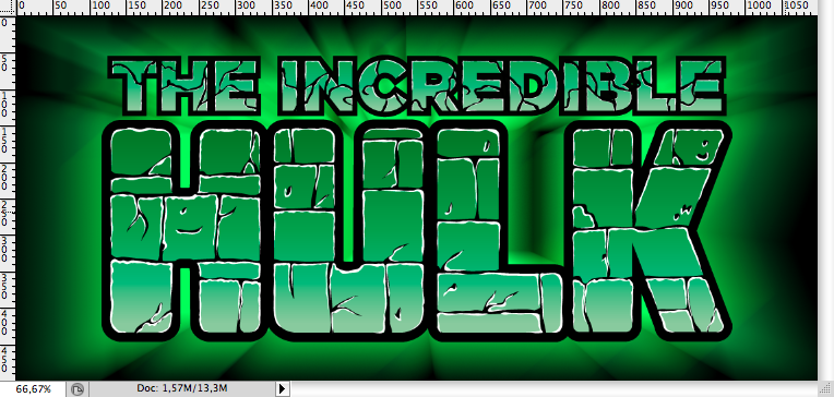
You should get something like these, now let’s apply a soft gradient using the gradient tool (G).
Step 2
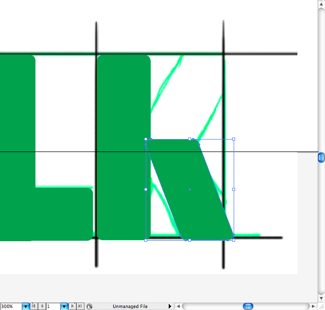
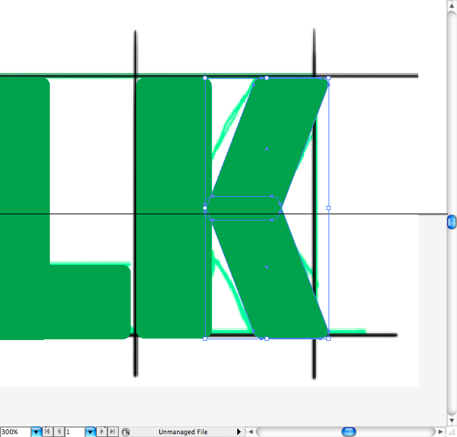
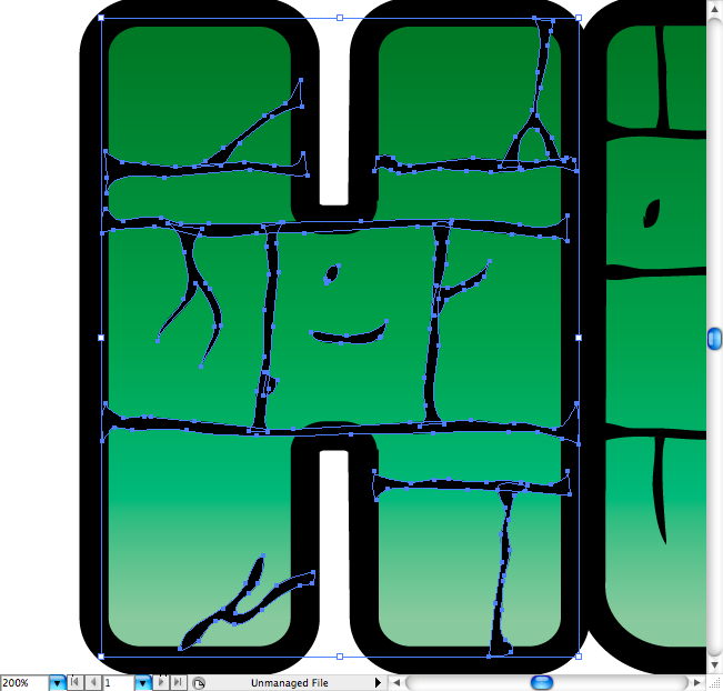
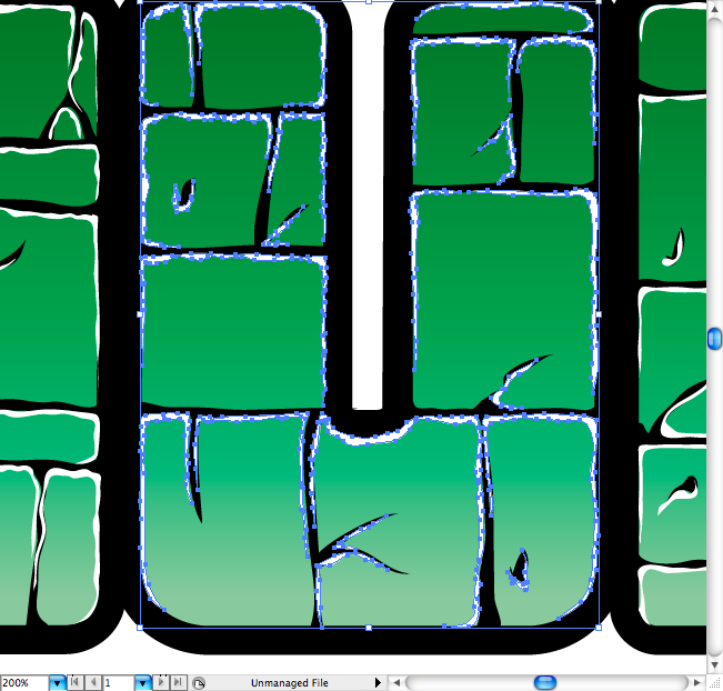
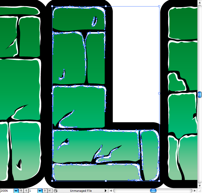
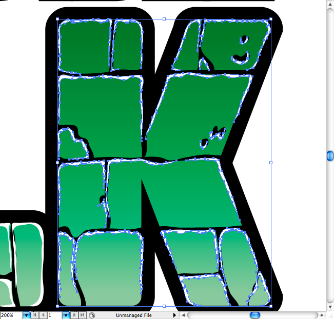
Let’s make the cracks around the lettering, it’s quite simple, but it will be easier If you use the pencil tool (N) an a a tablet, as the irregularity of it it’s easier to get this way then using a more flat tool as the pen tool (P).
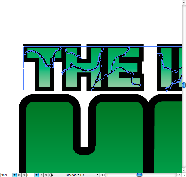
Now it’s time to add the reflexes to it, the logic it’s simple: Put the lights on the top of every crack, at first I mays not make any sense, but just take a look at the samples bellow and you understand it.
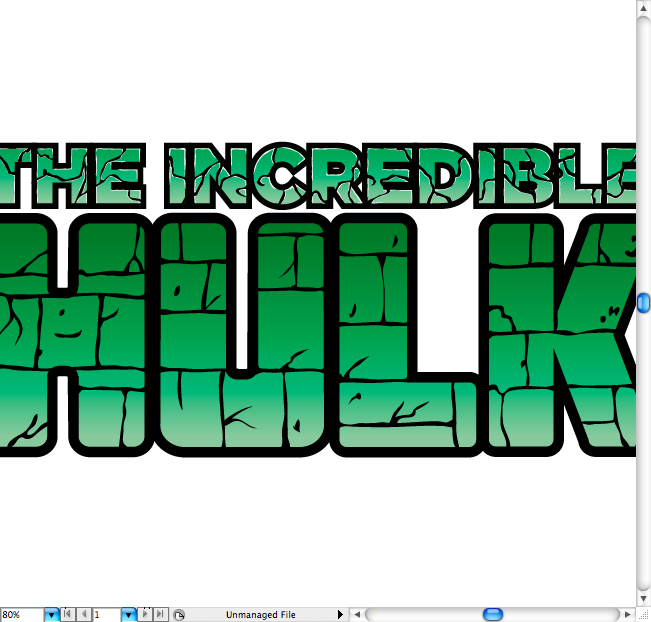
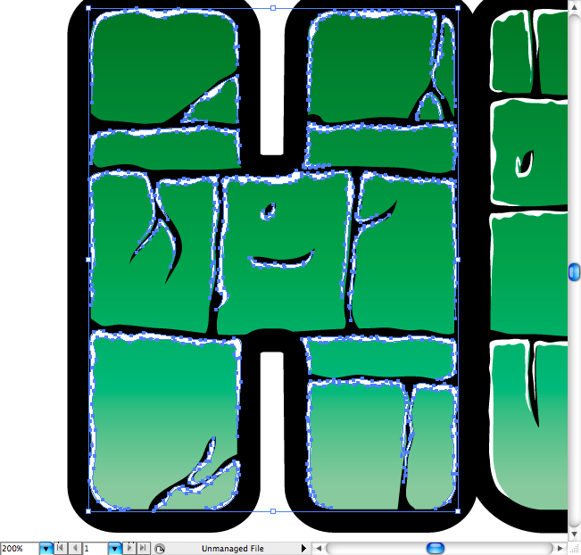
Let’s repeat the same procedure on each one of the big letters, but this time let’s make it more detailed. It should look like a brick based shape, so first you’re going to draw horizontal lines, then the vertical lines. Later using the pencil tool (N) add some cracks and ajust the lines to look more irregular.
This is a bit boring on the beginning, but as you understand the dynamic behing it, you will start doing it faster.
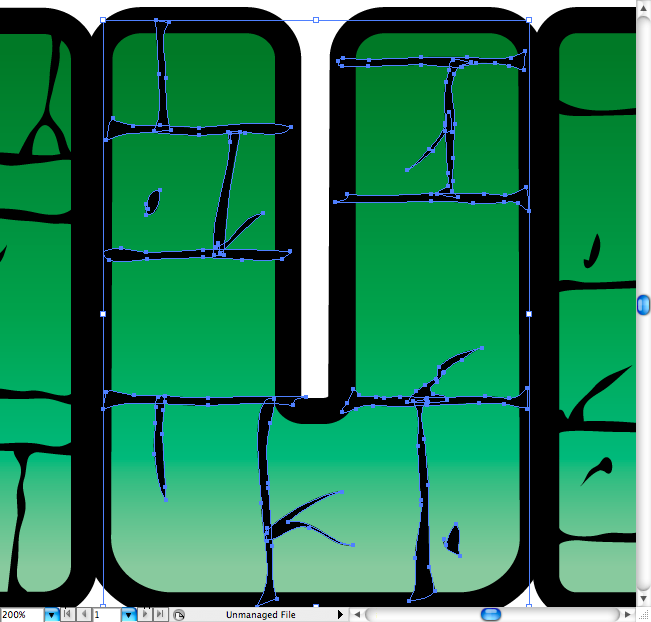
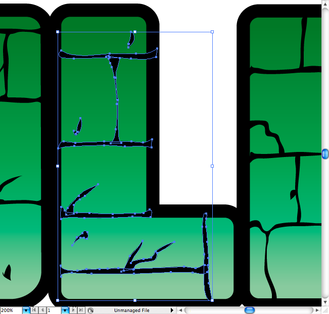
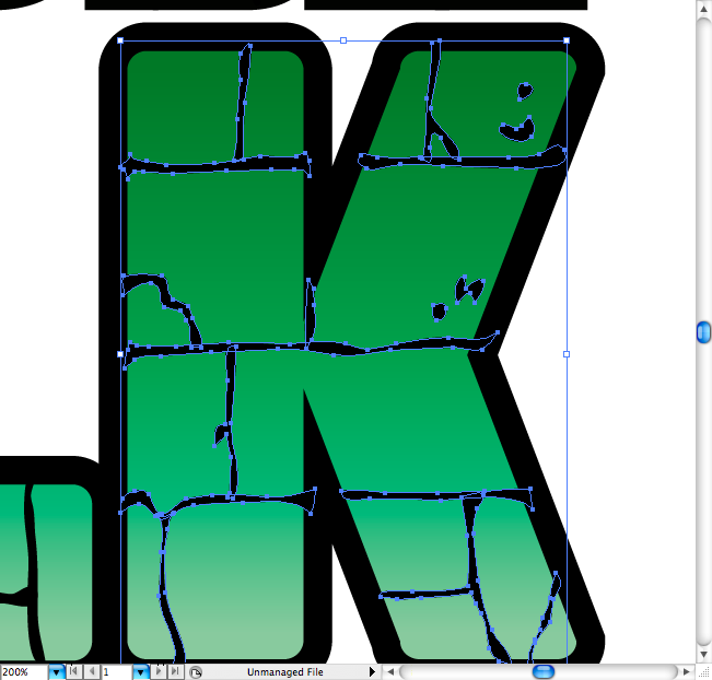
Using the same lightning rule applied on the lettering, do it again on the big letters. Remember: the light comes from the top, so most lights should be directed to this side.
Step 3
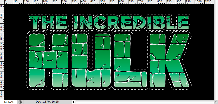
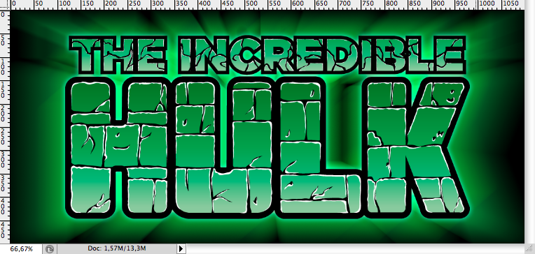
Now that we have the vector type ready, let’s open photoshop and add some textures and effects. First make a black background using the paint bucket tool (G).
Paste the type as a Smart Object and select it by command + click / ctrl + click on its layer.
Then make a new layer and using the paint bucket tool (G) fill it with a neon green. Duplicate this layer (command + J / ctrl + J).
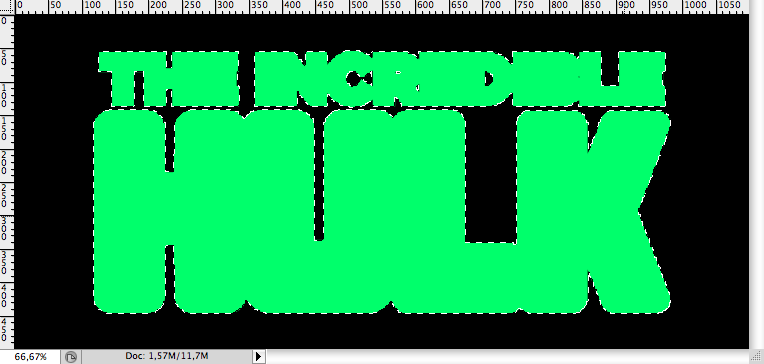
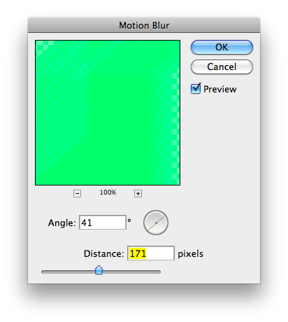
On the first one (the one on the top) you’re going to apply a motion blur (Filter > Blur > Motion Blur) with this settings. Then, set his blending mode to Soft Light.
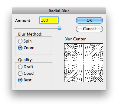
On the second one you’re going to apply a radial blur (Filter > Blur > Radial Blur) with this settings. Don’t forget to put both behind the smart object layer.
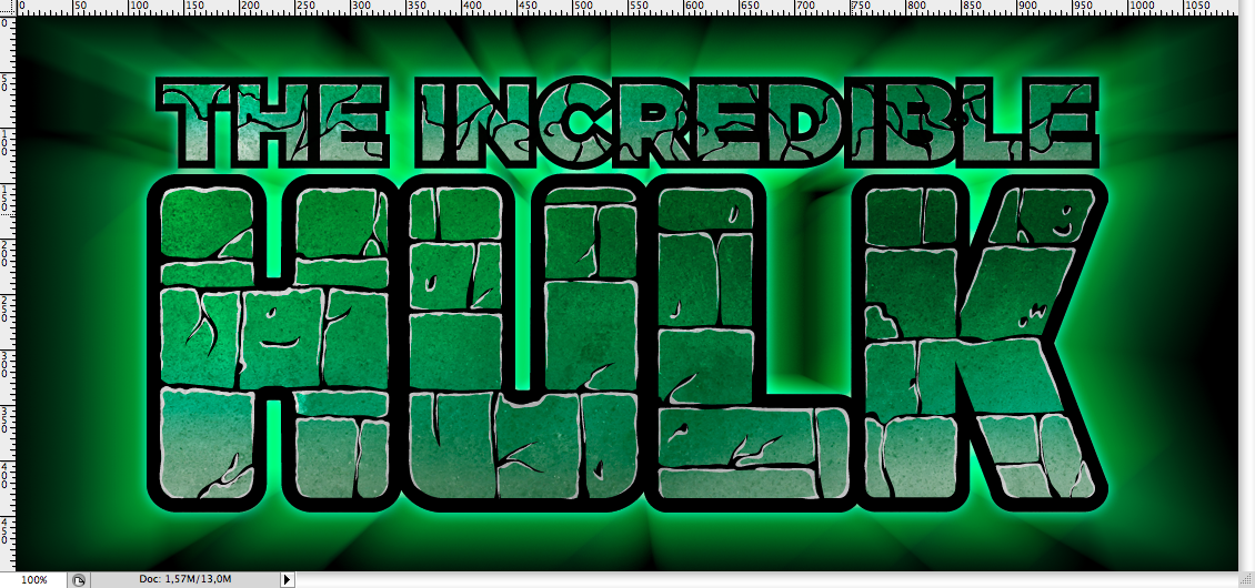
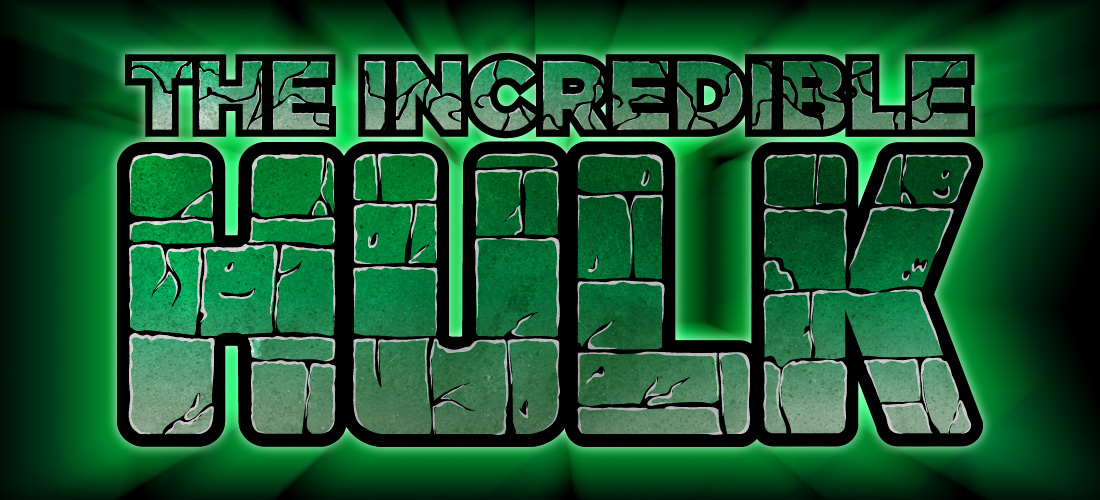
You should get this:
You can also add a soft outer glow on the type smart object (Layer Style > Outer Glow).
I used this grunge texture to give a a more realistic appearance to the image, you can download it right here. So first I paste it and used the smart objetc selection to create two new layer with it (command + J / ctrl + J).
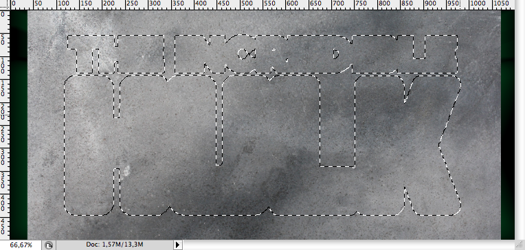
On the first one I used the blending mode called Multiply and set the opacity to 50%.
On the second one I used the blending mode called overlay, in order to lighten it. Don’t forget to put the one with the Multiply on the top and the overlay one bellow to get his final effect.
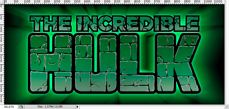
Conclusion
Download the Adobe Illustrator File
Download the Adobe Illustrator file used for this tutorial
About the author
My name is Marcos Torres, I’m Graphic Artist from Porto Alegre, Brasil. You can get to know more about me by acessing my Personal Website or by following me on Twitter: @marcos333. You can also see some of my last projects at my Flickr.
Sponsored Links: