Advertising is the age-old medium which has been transformed via the Internet. Ads can be served on websites in different ways than TV or radio shows. Google AdSense is the most notable company, although there are plenty of alternatives to consider. Not to mention the growing popularity of in-video ads!

But there is a systematic process for blending advertisements naturally into any website layout. Designers who have little or no experience with ad displays would do well to follow through on even a few examples. There is plenty of money to be made on the Internet if you know how to do it. And genuinely incorporating advertisements into your layout is the best solution.
Segregate Ads from Content
This should be a no-brainer since most visitors aren’t coming to the site for advertising needs. Your webpage content is king and all advertising should take a secondary backseat.
Now this isn’t to say you should avoid ad placements in-between areas of content. This technique is actually a wonderful way to increase click-through rates as visitors are scrolling through each page. However you don’t want big Flash banners protruding over words and paragraphs. This makes the site appear very unprofessional and you’re sure to lose traffic over time.
If you have courage test out some ad placements 1-2 paragraphs into the article. Some layouts also work with a small square ad block floating to the left or right of each page content area. Though in most cases this will look tacky, and it’s much nicer to keep ads horizontal in-between key blocks of text.
Matchup Color Schemes
Every website design must have some type of color scheme. Your choice of colors and fonts will dramatically affect the overall feeling of the site. And because of this you want to blend in your text ads whenever possible.

This can’t always be applied to larger ad blocks with images or flash banners. But match link colors if you are using contextual ads or even selling a link list in your sidebar or footer. When you have colors matching together it makes each ad block appear more ingrained into the site. Your ad links won’t stick out like a sore thumb which will definitely garner more clicks.
Utilize a Sidebar or Two
Unless you’re designing for a minimalist layout you should have extra space to include a small sidebar area. This is perfect for additional navigation links and extra related content. But it also leaves room to mix in advertising where available.
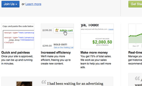
A very popular network BuySellAds offers extremely reasonable rates for independent publishers. You can setup smaller squares and sell ad blocks for a going monthly rate. Not only is this a wonderful alternative to AdSense but the network itself only serves professional-looking adverts. You won’t be caught up with spammy animated gifs or Flash content.
Now if you have the room it wouldn’t be a bad idea to incorporate two separate sidebars. You can hold more important navigation links in one side and still keep some advertising above the fold. This is the best area on your page for marketing and making money through ad networks.
Decorate with Flair
Each ad block area can be dressed up with some additional flair. How creative you get will surely be dependent on the design itself, and not every ad needs to be flashy. But sometimes it can look nice to include a custom border and background around the advertising space.
This rule mostly applies to ads found within your main content area. You can use different styles such as sketching borders and arrow glyphs to point out the ad zone. Creativity like this will attract attention from your visitors. But it can also make your ads look at bit prettier squeezed into the layout.
Offer Open Ad Sales
If you have advertisement zones open on your site why not offer them for sale? This can be accomplished with a simple informational page somewhere on your site going over contacts and payment methods. But additionally you could design a generic graphic in place of some ad forms(such as a 125×125 block). This could read something like “Buy Ad Space” and would lead to your advertising/contacts page.

If you can manage control over the design then it’s simple to match these sale zones with your overall color scheme. This technique is a great way to attract attention from interested publishers looking to advertise around the web. It also gives you content to fill in the sidebar while waiting to acquire some initial advertisers.
Visitors aren’t expecting you to pretend like ads don’t exist. We all understand the purpose of advertising and how it makes money for webmasters. Don’t pretend like your visitors are ignorant and must be tricked into using your ads. Just place them in opportune areas on the page and blend as best you can with colors and possibly background patterns. Over time you will draw attention and may even turn a small profit.
Conclusion
These tips and tricks should get you started thinking about customizing with many different ad block areas. It requires time and practice in the design field to understand and build compatible web layouts. Advertising and marketing is just another facet to consider.
Stick with what works best and check out websites similar to your own for inspiration. If you have ideas or suggestions on web advertising feel free to share with us in the post discussion area below.


