Only once in the history of Photoshop has Adobe released a free public beta, until now. Photoshop CS6 Beta is now available for free download from Adobe, for a limited time (the beta will eventually expire, though at the moment there doesn’t seem to be a set date for that to happen).
This is a beta release, and while Adobe says they’ve done thorough testing, there are bound to still be some bugs. To that end, make sure that if you’re working on a critical project, you’re prepared for that (and that you save often!).
During a couple days of testing, I never ran into issues with CS6, but that’s not to say you won’t. That’s just the nature of a beta product. Below, check out my thoughts on what CS6 has to offer.
Amazing performance gains
One of the first things any regular Photoshop user is going to notice is the performance gains. I tested CS6 on a MacBook Pro that’s a few years old; it has a 2.26GHz Intel Core 2 Duo processor, 8GB of RAM, and the NVIDIA GeForce 9400M. So while it was a powerful enough computer a few years ago, it’s pretty much a base model by today’s standards.
And yet, running filters, saving files, and performing various other tasks—things that had noticeable lag in CS4 and CS5—are almost instantaneous. If you use filters on a regular basis, and especially if you’re on an older machine, upgrading to CS6 is going to save you tons of time and frustration. It’s rare that a new software product comes out that works better on older computers than the older versions, but this is definitely one of those instances.
A more attractive interface
The new default interface for CS6 is significantly more attractive than older versions. It’s got a dark gray background compared to the light gray of older versions.

The good news is that while the interface looks significantly better, the layout is still mostly the same. All of your menus are basically the same, the workspaces are the same (though you’ll notice the addition of a new 3D workspace), and the basic user experience will feel familiar to anyone who’s used older versions of Photoshop.
If you’re not crazy about the new dark interface, you can change it in the Preferences menu. There are four basic color schemes available, including the light gray that previous versions of Photoshop have sported (plus medium gray and black).
Content awareness
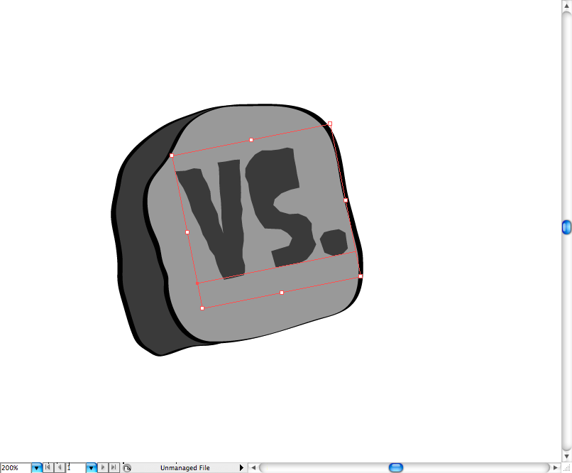
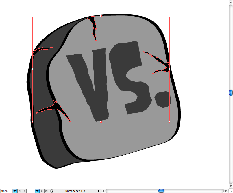
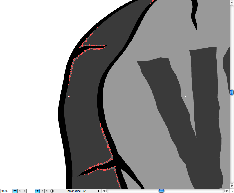
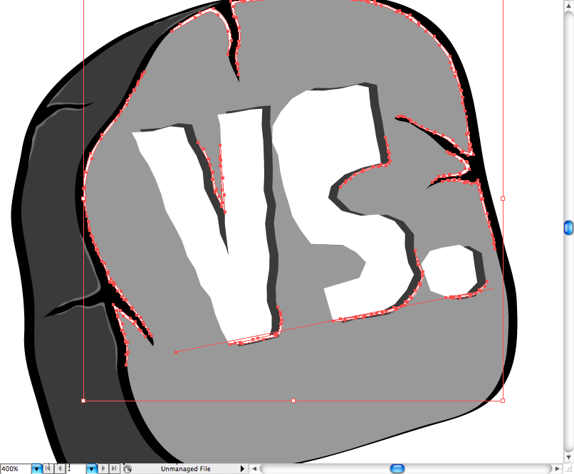
The new Content-Aware Move Tool is going to be a lifesaver for a ton of people. While it’s not perfect for every situation, it does make life a lot easier if you need to reposition things within a photo. It seems to work best on images with a fairly random background pattern (I tried it on a photo of a porch floor with regular boards and it was definitely noticeable where the element had been moved from), but even on more uniform or regularly-patterned backgrounds it can do a passable job.
All you have to do to use the Content-Aware Move Tool is trace around what you want to move, and then drag it to its new position. CS6 does the rest, processing and then filling in the background behind the moved element.
Camera Raw for everyone
If you do a lot of photo editing, then the ability to use the Camera Raw interface whether or not an image was shot in Raw format is going to be useful. The controls are easier to use than previous versions, and the new Highlights and Shadows controls (borrowed from Lightroom 4) make it easier to get more detail out of your shots. It’s definitely a huge upgrade for photographers.
Video editing
If you wanted to use Adobe products for video editing, your previous options were limited to Premiere Elements or Premiere Pro. Not anymore. Now you can perform basic video edits right in Photoshop.

While the video editing options are limited, and probably aren’t going to be user-friendly to those used to professional non-linear editing programs (like Premiere or Final Cut Pro), it’s a great option to have for anyone who just wants to cut a basic video. The biggest downside is that while you can apply filters or other effects to your footage, it only does it on a frame-by-frame basis.
Searchable layers
This is possibly one of the most useful features for many designers. How many times have you been working on a design with hundreds of layers? It’s not uncommon. And the biggest issue when working with files that complex is trying to find the layer you need to edit. CS6 brings searchability to your layers, streamlining the process and your workflow.
Typographic enhancements
Setting type in Photoshop is frustrating at times. This is partly due to a lack of typographic controls included in programs like InDesign. CS6 adds Paragraph and Character Styles, which should go a long way toward creating consistent typography in your designs.

A built-in dummy text generator makes things easier for designers, too. Forget about having to turn to the internet for your filler text needs. Just create a text box and then go to the Type menu to find “Paste Lorem Ipsum”. The box will be filled automatically with dummy text. It doesn’t get any easier!
Finally: Auto-Save!
I think every designer out there who’s used Photoshop for any length of time has experienced those horrible crashes and lost minutes (or hours) of work. Finally, in CS6, Photoshop will include an Auto-Save feature.
It also brings Background Save, which means you can keep working in other windows/tabs while your machine saves a file. While save time isn’t really an issue with small files, when working with large photos or other large files, saving files can take a minute or more (which seems like an hour when you’re eager to keep working).
Worth the download
Considering Photoshop CS6 is available as a free limited-time beta, it’s definitely worth the download. In testing, I didn’t run into any bugs, but that doesn’t mean there aren’t any. To that end, make sure that you save often, and be wary of the newest version if you’re under tight deadlines or otherwise things need to run smoothly.
CS6 is definitely an improvement over CS5, especially for designers. The addition of tools like a Lorem Ipsum generator, basic video editing, and even more awesome photo editing tools, CS6 has really taken Photoshop to an even higher level.
Written exclusively for WDD by Cameron Chapman.
Have you tried the new Photoshop CS6 Beta? What did you think?
| 12 Business and Portfolio WordPress Themes – only $17! | |