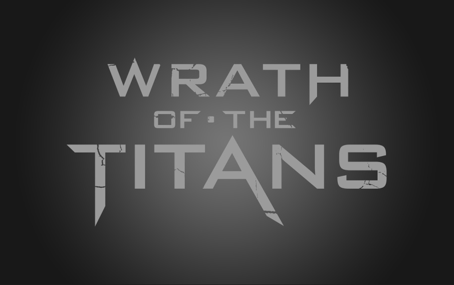
Impact is the key in design. Make the viewer take notice. Persuade them to stay. Make them see the message and then sell it.
Design is the balance of elements to create a visual message and nothing does it better than the propaganda poster. Simple, bold and moving, these have been used throughout history to provoke an emotional response in people. It’s been used in ads, album covers, politics, war, and can be used in web design for some really stunning, incredible impact.
It’s not just looking at examples as many propaganda posters break the rules of the real world. Forget what you learned in foundation drawing and painting classes. There’s no denying that propaganda posters are popular for their powerful visuals as well as the nostalgia they evoke: of better days when we all tried to murder each other with gleeful abandon and portray other cultures as less than human.
Propaganda is a message that may or may not be true but it convinces people to see its message and persuade them that it IS the truth. This power can be harnessed by web designers for UI that will make atheists pray and the devout sin.
*Author’s note: Posters are presented solely as examples of design and in no way promote, excuse, or highlight fascism, communism, patriotism, or any other “ism” that exists or has existed. This article deals with the power of images and a survey of what makes them so persuasive. They were not chosen to offend anyone…but they will. That is part of their power and what we will explore.
Some examples of powerful images
War propaganda has included the most notable images in the history of coercion. Big, bold uses of strong and brave men and women, selfless dedication of soldiers and civilians, suffering of civilians, heavy lines, pushed angles and depth, and powerful use of photographic images, color, and shading.

Heroic and bold! It romanticizes war and those who fight, struggle, and die. Notice how the lines of perspective create dramatic focus. The perspective is not real but the push of non-reality helps the power of the images. Also notice that the images are dark, which adds mystery and strength. The lightest areas in these images fall on the faces. Stern and purposeful faces, which are the human element in the posters.

On top of powerful images, twisting stereotypes dehumanize the target enemy. It’s so much easier to kill others if they are monsters, rather than human beings. Not long ago, in the dark days of Madison Avenue advertising, the beautiful people used the best product while ugly, stupid people used the other brand and suffered dingy clothes and bad breath. No one wanted to be “those” people.

Of course, using heart-wrenching emotion, guilt, furor, and death are great motivators. It works for war and, as we’ve seen with the upcoming 2012 presidential election, politics! It was said of advertising that if you put a puppy or baby into an image, you will have a winning ad. If you have a baby WITH a puppy, you’ll have the greatest ad! In propaganda, a dead mother with her crying baby was the way to rev up emotions. Can you imagine a dead puppy in there, too?
The trick to all the angles
One of the most powerful elements in these designs is something you probably don’t see: the areas of maximum attention. The angles used in the design of these posters push the eye, draw attention, and create movement and even emotional response. Let’s break down some of the layout techniques in these posters.
Using the areas of maximum attention isn’t only for drawing attention to the image in the posters shown here, it is also to use the image area to make the negative space more important and powerful. Use that attention and power for the elements you need to navigate and educate. Photographers, illustrators, and designers of great propaganda posters knew the power of the angularity they captured in their work.

One of the best examples of pushing angles and breaking the rules of real life are the propaganda posters (although some would refer to them as “motivational” or “cause-based”) created in China. Upward angles for those in the forefront, descending perspective of crowds behind them and giant figure elements taking the same importance as the smaller elements, yet everything holds the same attention without overpowering the other element.
Usually, in depth-of-field, elements in the far background will appear blurred and muted but these poster examples break that reality, and do it with extreme effectiveness. It drives a powerful message and it is worth exploring for use in web page design. I don’t understand why someone hasn’t used these except with everyone holding iPads instead of Chairman Mao’s little red book.
The negative space also works well in conjunction with these mixed elements and that is the space you will use for text, menus, or anything else that needs to hide in plain sight. The angles of the images will also help spotlight whatever you choose to place in this area. Give it a try. Open a propaganda poster in Photoshop and drop in a menu or picture or logo and see how it stands out.
Colors and emotion
Stay mindful of the colors in these posters. They push some odd but effective palettes. Color is a powerful motivator of the sense of sight, just as aroma is used for the sense of smell. Colors bring about emotional response in the viewer. Our personal and cultural associations affect our experience of color.
As I wrote in an article on the psychology of color, colors are seen as warm or cool mainly because of long-held (and often cross-cultural) associations. Yellow, orange, and red are associated with the heat of sun and fire; green, blue, and violet with the coolness of leaves, sea, and sky. Warm colors seem closer to the viewer than cool colors, but vivid cool colors can overwhelm light and subtle warm colors.
Although red, yellow, and orange are in general considered high-arousal colors and blue, green, and most violets are low-arousal hues, the brilliance, darkness, and lightness of a color can alter the psychological message. While a light blue-green appears to be tranquil, wet and cool, a brilliant turquoise, often associated with a tropical ocean setting, will pop more to the viewer’s eye. The psychological association of a color is often more meaningful than the visual experience of the elements themselves.
Studies have also shown that certain colors can have an impact on performance. Exposing students to the color red prior to an exam has been shown to have a negative impact on test performance. More recently, researchers discovered that the color red causes people to react with greater speed and force, something that might prove useful during athletic activities.
Black is the color of mystery, authority, power, and evil. It is popular in fashion because it supposedly makes people appear thinner. It is also considered stylish and timeless. Black can be accented with any other color as it is the ultimate neutral color, albeit the most powerful.
White is cleanliness, sterility, innocence and purity. White reflects light and is considered a summer color. White is popular in decorating and in fashion because, as with black but at the opposite end of the spectrum, it is light, neutral, and goes with everything.
Red is the most emotionally intense color. It is the color of blood, the color of the devil, Mars (the god of war), but also the color of a Valentine Day heart. Red stimulates a faster heartbeat and breathing. Red ties are known as “power ties” and are favored by CEOs and politicians. Red cars, according to police statistics, are popular targets for thieves. In decorating, red is usually used as an accent to draw attention in a room or for a doorway.
The most romantic color, pink, which is a shade of red, is more tranquil and considered feminine. Candy is often pink and it is a color that inspires happiness.
Blue, as the color of a clear sky and a deep ocean, is one of the most popular colors. It causes the opposite reaction as red. Blue causes the body to produce calming, tranquilizing chemicals, so it is often used in bedrooms. Blue can also be cold and depressing. Fashion consultants recommend wearing blue to job interviews because it symbolizes loyalty. People are more productive in blue rooms. Studies allege that weightlifters are able to handle heavier weights in blue gyms.
Green symbolizes nature and the current recycling, save-the-planet movement. It is the easiest color on the eye and is reported to improve vision. It is a calming, refreshing color. People waiting to appear on TV sit in “green rooms” to relax. Hospitals often use green because it relaxes patients. Dark green is masculine, conservative, and implies wealth. It is also a color of luck, as in a four-leaf clover.
Yellow is a happy, cheerful color that draws attention, especially when paired with a strong contrasting color. While it is considered an optimistic color, people lose their tempers more often, and babies will cry more, in yellow rooms. It is the most difficult color for the eye to take in, so it can be overpowering if overused. Try looking at a yellow wall of a website for a long period and you will most probably get a splitting headache. It is believed, however, that yellow enhances concentration and that it speeds metabolism.
Purple is the color of royalty and connotes luxury, wealth, and sophistication. It is also feminine and romantic. However, because it is rare in nature, purple can appear artificial and often causes a “vibration” when not used in a proper color palette.
Brown is solid, reliable, and is the color of earth. It is abundant in nature but varying shades have very different emotional responses. Light brown implies genuineness while dark brown is similar to wood or leather. Brown can also be sad and wistful. Brown is often considered a “male” color.

Posters for those on the home front were happier and certainly more colorful. The use of colors were energetic and friendly. They motivated by pumping up the emotional pride civilians needed to feel during the war, both for war production as well as to encourage volunteers for the armed services. Bold areas of color are always a winning move in design!
Translating this all to the web
You’ve no doubt seen articles with “great one page web sites” and “incredible intro pages” (lest we not forget the hilarious 404 Not Found pages). One image can wield more power and attention than a page of a thousand elements. Simplicity is the preferred human stimulus and we are becoming more acclimated to simplicity. One button, one action. One choice, one solution. One question, one answer. Strength has become something that crosses levels of comprehension. Simple and strong speaks to every level of education. All of the posters in this article were designed to speak to every member of the society in which they lived. They relied on recognizable readability and emotional response.

While these may not be web sites, it’s obvious that the designers who created these pieces got the message about propaganda design. To see more examples, just Google “Star Wars propaganda posters.”
It’s still about the navigation
Color and image will draw the viewer in. They will fascinate him or her and make them want to explore the site. So how do you make it a pleasant and efficient experience? Buttons and links must present themselves in easy to spot places. They must be readable, easy to click and present themselves in mapped places throughout the site. Have you ever clicked on a small type link on a site and then realized it was the wrong link because the links or buttons were too small and too closely spaced? Nothing will make a viewer leave a site faster than frustrating navigation.
With all of these elements mixed together, your talent as a designer and a little knowledge and inspiration, you can create stunning web pages, whether it’s single page sites or multiple pages for just one site. Even better if it’s made for peaceful purposes!
Speider Schneider is a former member of The Usual Gang of Idiots at MAD Magazine and has designed products for Disney/Pixar, Warner Bros., Harley-Davidson, ESPN, Mattel, DC and Marvel Comics, Cartoon Network and Nickelodeon among other notable companies. Speider is a former member of the board for the Graphic Artists Guild, co-chair of the GAG Professional Practices Committee and a former board member of the Society of Illustrators. Follow him on Twitter @speider
Have you created a site or print piece based on propaganda posters? Give us a link and share it!
| Learn the ins and outs of WordPress – only $14 | |