By nature, the web is a chaotic place where people hop from page to page at will. Unfortunately, this freedom can work against those websites whose content is best followed in a certain order.
Design techniques make it possible to direct users along a path with varying degrees of persuasion. But when is it best to direct users, and how?
What defines linear content? You’re reading some now: articles are akin to streams of thought presented in a certain order. The written word isn’t alone. Although users may skip back and forth in videos and sound files, these media restrict their audiences to a timeline.
Linear experiences don’t have less importance in a multitasking, hyper-threading world. When used well, web designers can use this concept to their advantage.
How does it work?
The real problem isn’t how to use a linear experience but how to keep attention in a medium built on distractions. Because web designers can’t control external factors, they must work to keep users engaged. A web page must constantly answer the unspoken questions: “What’s in it for me?” and “Is something better on?”
Users will always have the option to leave. They can click bookmarks or their browser’s back button, or use their browser’s search field. Or click that link to that funny cat video their friend just IM’d. They might just close the browser window. Persuading users to stick to a track requires unconventional thinking.
Keeping users focused is a problem. Linear presentation is a solution.
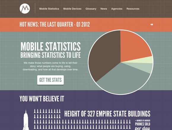
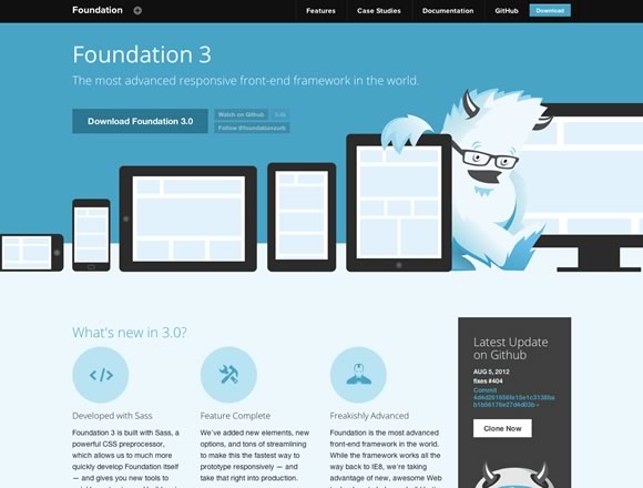
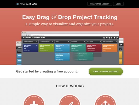
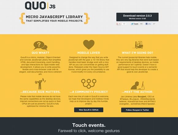
Use a single-page site
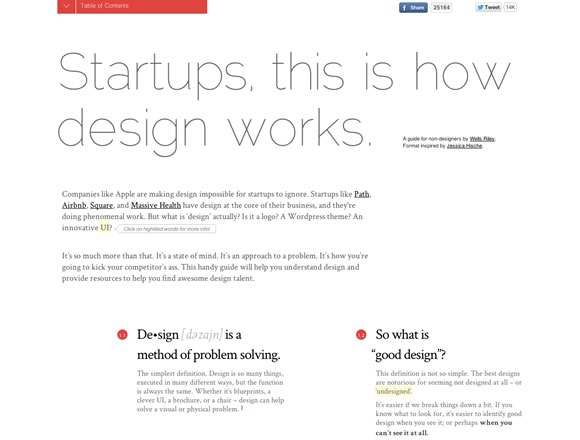
The easiest way to create a linear presentation is to use a linear format. Single-page sites roll all their content into one long page to make users scroll horizontally or vertically (but not both). The trick to luring people who are adverse to scrolling is to make them believe scrolling is worth their while. It’s the same idea with links: people choose to click.

Experience control
- In a multi-page website, users control which pages they visit.
- In a single-page website, designers exercise more control over how users view content.
Search engine optimization
- Multi-page sites allow for granular metrics.
- Single-page sites rely on click events and successful click-thrus.
Performance benefits
- Multi-page sites load content on demand (as users click each page).
- Single-page sites have minimal delay between sections (one page, one load).
Performance detriments
- Multi-page: users must wait for each page to load.
- Single-page: may load content that does not interest users.
Best for sites
- Multi-page sites that will add content over time.
- Single-page sites that need to compete for users’ attention or have one concise message.
Best for users
- Multi-page sites are good for people seeking one specific fact or only the latest updates.
- Single-page sites are good for people who need the big picture or who are new to the topic at hand.
Keep distinct sections
Like run-on sentences, long pages can overwhelm and confuse users. One long train of thought is difficult to absorb. Breaking a long page into distinct sections, each with its own header and footer, allows people to “hop” from thought to thought.
If possible, try to keep each section roughly the same size. Like any grid, rhythm sets a comfortable precedent. When used well, “above the fold” is not a barrier — it’s a tool.

Use in-page navigation
Traditional navigation bars serve two purposes: first, to let users click among topics that interest them; second, to show users where they are in context of the site. Navigation does not become less important if a site only uses one page. Single-page navigation has the same goals while helping to define transitions between sections and answering “are we there yet?”
Remove distractions
A vital technique to keep users’ attention is to shorten the time between interesting or meaningful information on a page.
Be it a specific fact, a good read, a favorite video they’ve seen a hundred times, or a quick time-wasting game, visitors go to websites for a reason. Narrative websites aren’t necessarily shorter, but make it easy for users to “hop” from piece to piece.
Cases suited for a linear web experience
Although linear experiences or single-page sites aren’t best for every case, they are useful under the right circumstances.
The quick sales pitch
Online shoppers may browse and search as they please, but the checkout process follows a definite path. For people selling only a few items, a one-page site is ideal: from sales pitch to clicking “confirm order” customers are not distracted by side pages. The scroll-down shopping experience guides them to the natural conclusion.
Each Kickstarter project is akin to a single-page site: introductions, descriptions, examples of work, and options to donate make every project their own self-contained sales pitch.
Surveys
Sites designed to collect information guide users between steps are inherently linear. Depending on the techniques used, a survey can eliminate unnecessary steps as the user progresses, tailoring user experience on the fly. For example, “if you answered no, skip the next section” can become automatic.
Email newsletters
Web pages delivered via email tackle the difficult prospect of avoiding users’ delete button. In spite of being limited to one page with the same goal, be worthy of someone’s inbox. Solutions to compelling email design aren’t limited to email. Websites that need to reach users with limited attention or marginal interest can use the intro-explanation-action formula found among email template designs.
Describe a process
Content that explains a system, uses a flowchart, or shows change over time can use vertical space to great effect because users don’t have to click away from one piece to see another.

The BBC’s Ocean Depths encourages users to scroll down to the deepest points on Earth.

Living with Nest takes people through a year of using the Nest thermostat as they scroll down.

Evolution of the Web also scrolls to follow time, but moves horizontally rather than vertically.

Experimental web comics by Scott McCloud turn users’ browser windows into a running comic panel.

Dangers of Fracking follows a drop of water, using vertical scrolling to trigger events along the way.

Ignition Creative uses scrolling as a tool to organize sections of their single-page extravaganza.
Is linear user experience the right tool for your job?
Linear experiences, single-page or otherwise, aren’t ideal for every project. If scoring highly with search engines is a priority, remember that Google likes internal links. They also say “Make pages primarily for users, not for search engines.” However, sites with straightforward presentation force designers and editors to scrub their content free of extraneous material. Restrictive parameters can lead to innovative solutions.
In the end they always have the power to leave, which makes persuading users to follow a path, challenging in any web project.
What techniques do you use to direct people around a website? Have you developed a linear-style site? Let us know in the comments below.
Written exclusively for WDD by Ben Gremillion is a web designer who thinks if you read this far, you get the idea.
| JavaScript Madness eBook Bundle – only $37! |  |