16 Tips for a Better Website

Advertise here with BSA

Want a better website and don’t know where to start? Or, do you think your website changes are out of your control?

Many website owners think a better website means a complete overhaul – a brand new website. In some cases that may be true, but in my experience a couple tweaks can make the difference between bland and beautiful.

There are hundreds of things you could be doing. But, I want to take you beyond just spell-checking your site for errors.

Here are 17 ideas you can put into action right now:

1. Condense your menu

Do you have twelve items under one heading on your navigation bar? If so, you might want to look at tidying up. A cleaner navigation makes things easier to find. When things are easier to find, it creates a better experience for your site’s visitors. Plus, they’ll be less likely to hit the back button because they won’t be frustrated trying to find what they need.
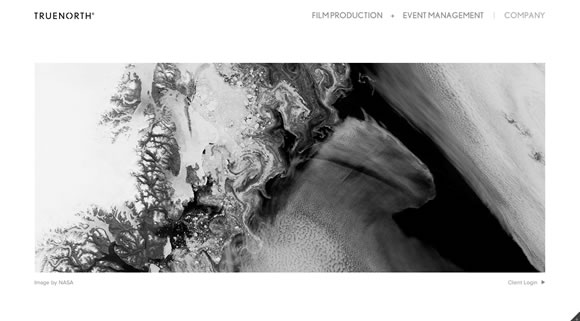
17 Tips for a Better WebsiteBeautiful menu from website TRUENORTH

2. Have a call to action on every page

Every page on your website should be making your visitor act on something. Maybe it’s to get them to purchase your ebook, view your credentials, or watch a demo video. Whatever it is, make it known to the user. Remember, they don’t want to think when they’re browsing your site. Whether it’s a button or a hyperlink, but something on every page that leads them to the action you ultimately want them to take.

3. Put your phone number on your homepage

Every website should have their phone number. Seems obvious, right? But, many don’t. It’s often buried on a contact page or not on the site at all. Big mistake! Many visitors head to your website just to find your phone number, so make it prominent on your homepage. The top right corner is usually best – or, I’ve also seen it down in the footer. Regardless, put it up there!
17 Tips for a Better WebsiteImage from Emir Ayouni

4. Add business hours

Similar to the phone number above, when is your business open? Can I call you at 6am? What if I’m bringing my parents to your restaurant and it’s 10pm – will we be able to eat? These questions are inside the head of your customers more than you think. Making your hours known solves this, so put them up for all to see.

5. Add an about us page

Who are you? Do you work with a big team? When a business person – or consumer – selects a company to do business with, they often like to know who they’ll be working with. Add pictures of your team with real bios. Sure, professional experience is awesome, but list your hobbies, family life, and things you like to do for fun. Bottom line: show you’re a real human being.
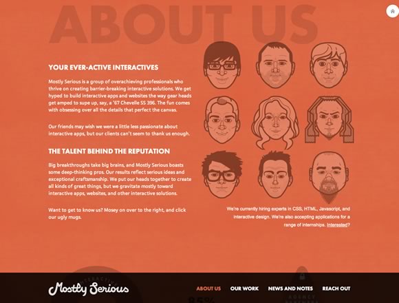
17 Tips for a Better WebsiteAbout page from Mostly Serious

6. Use big, bold images

This seems to be a pretty big trend in web design, but it’s because images speak louder than words. Capture your visitors with beautiful imagery. Take pictures of your team in action, shots of the local area, or recent projects you’ve worked on.

7. Add a directions widget

For those without a GPS, directions are convenient for just about anybody. Google has a free map widget you can add to your site. Just enter your address and you’ve got directions right to your front door. It shows prospective customers you care about the whole experience.

17 Tips for a Better WebsiteImage from Dash

8. Make your site mobile-friendly

Mobile is huge right now. With over 50% of Americans owning a smartphone, your new customers are likely to come from mobile browsing. But, it’s tough to navigate a site not optimized for a tiny screen. There are plenty of inexpensive tools to create a mobile website from your current site. Explore those or get a designer to make your site mobile-friendly.

9. Match your company branding

Did you just update your logo or change your company colors? Make sure your brick and mortar experience matches your online experience. It helps to create brand awareness so customers recognize your company when they’re on the road or describing it to colleagues.

10. Cut the distractions (ie. music and splash pages)

Do you have Frank Sinatra playing on your site, or a splash page that blocks people from getting to what they need? Remove it all. Why? Not only is it annoying for many visitors, but it distracts them from doing what you want them to do.

11. Get social with your customers

Haven’t hopped on social media yet? These days, it seems like the entire world is on social media in some way. We’re social people who like to interact with friends, family members, and even strangers. Plus, we listen to their recommendations. You want in on this community building. Get started with a Facebook page or Twitter account and focus on mastering one of them. Then move to the next network.
17 Tips for a Better WebsiteImage from Visual Idiot

12. Add industry resources

Want to establish yourself as the company to go to in the industry? Then add some resources to your website. This could be reports, surveys, white papers, or helpful links. This material demonstrates to prospective customers you know your stuff. So, get writing!

13. Put your customers to work – add testimonials

Your current customers are a huge asset to your company because they can provide real-world case studies – and testimonials – as to how your company has helped them save time, save money, etc. Reach out to your best customers and ask for a testimonial. Here’s a tip: have it pre-written, so all your customer has to do is approve it.

14. Figure out your site’s main goal

Why do you have a website? What do you want your site to do? After you figure out these two questions, make sure your website accomplishes the goal: add or delete pages, restructure your site, make a new landing page, etc. Make your goal a top priority. And let your team know what that goal is so they can help out too.

17 Tips for a Better WebsiteImage from Riley Cran

15. Start from scratch

While this isn’t recommended because it takes a lot of time, money, and resources, it may be worth it. If you’ve got an old website, starting over with brand-new technology would be smart, rather than trying to patch what you already have. Start with a pencil sketch of what you want and assemble the best team to make it happen.

16. Hire a professional

This leads me to hiring a professional. If you’ve kept your web work in-house, it may be worth looking at bringing in the big guns. They’ll not only move the project forward, but they’ll bring their own experience and expertise to the project.
17 Tips for a Better WebsiteImage from Jeff Broderick

Again, there are more than 17 tips to a better website, but this should be a good start for you. Pick
a couple and make the changes to your site – or have a developer/designer do it for you.

Best of luck taking your website to the next level!

Posted in Blog | Comments Off on 16 Tips for a Better Website

Magazine design principles applied to web design

magazine design principlesI got my professional start in the world of design at a specialty magazine publisher. Magazine layout and design is, therefore, very close to my heart.

A lot of principles of magazine design and layout are easily transferred to the world of web design. Some of these are pretty obvious, while you may have overlooked others. But really, it’s all about good design transcending medium.

Here I’ve covered some of my favorite lessons from magazine design, and how they can apply to web design. But the most important thing I hope you can take away from this article is that you can take design ideas and conventions from one form of media and apply it to others.

So if your background is in something like interior design or graphic design or even something like industrial design, you can take those principles you already know and apply them to your web design projects.

Simple background = better readability

If you open 90% of magazines, the main background color behind the body copy is white. While tradition is the main reason for this, that tradition started for good reason (besides printing technology). Even in cases where a white background is not used, a simple, solid-colored or subtly-patterned background. This makes the body copy very readable, and helps prevent eye-strain.

In some cases, you’ll find body copy typeset over an image, but in those cases, you’ll often find that the type size has been increased and special attention is paid to ensuring sufficient contrast between text and image. And it’s rare to find an entire article typeset over images. The same should be applied to any website design.

Maintain consistency throughout

Flip through any magazine and you’ll likely notice that there is a lot of consistency from one page to the next. Fonts are the same. Headings are the same. Basic page layouts are the same. Sure, articles might have some deviations in how they’re laid out, but things like page numbers will be found in roughly the same place and images will likely be shown in the same style, among other consistencies.

This consistency is reassuring to the reader. They flip from one page to the next and they know what to expect. The same goes from one issue of the magazine to the next.

This kind of consistency can easily be transferred to the world of web design. Make sure that things like your header, navigation, and other key elements of your layout are the same throughout the site. Along the same lines, make sure your fonts are consistent throughout the site, not only the font face, but also the size and styles used.

Any deviation draws attention

Because magazine layouts are so consistent, any deviation from the standard layout draws attention. It stands out among the other pages. This is why, so often, we find that the main featured article in a magazine has at least the title page formatted differently.

The same principle can be applied to your website. If you have a particular page that you want to stand out, make changes from the standard layout. This is often done with two particular types of pages: landing pages and art-directed blog posts. In either case, the point is to make the page special in the eye of your visitors.

Advertising is clearly marked and not intrusive

Advertising in magazines is always clearly delineated from the magazine’s content. Either it’s visually distinct from the editorial content, or it’s marked specifically as advertising.

This has to do with trust. If your readers aren’t sure what’s editorial and what’s advertising, then they’re less likely to trust your content. This is particularly true with things like sponsored blog posts. If it’s not clear that it’s sponsored, your readers may feel duped if they initially believe it’s editorial only to find out differently later.

Big images are better images

Magazines tend to use larger images. In fact, you’ll see a lot of images that cover a full page or even a two-page spread.

The same can definitely be adopted by websites. Use images that take up your user’s entire screen. They’ll grab the visitor’s attention, while also being more visually appealing. Incorporating large images into your design is a bold move, and one that can really set apart the design of a site.

Ditch big blocks of text

This one might not seem quite as apparent at first. After all, most magazines have huge blocks of text. Entire pages, in fact.

But those big blocks of text are generally broken up by things like pull quotes or images. You rarely have page after page after page of text in consumer magazines (trade or scientific publications can be a different story).

So rather than layout your site’s main text in big chunks, break it up with typographical elements, images, and even advertising. Even things as simple as keeping your paragraphs short and breaking up your content into sections with headers can make a huge difference in readability and holding your visitors’ interest.

Use the grid, but don’t be afraid to break it

Magazines are laid out pretty strictly along a grid. But at the same time, you’ll often see layouts that purposely break the grid. Elements like images or pull quotes will straddle columns, adding visual interest to the layout’s design.

While breaking outside the grid can be slightly more technically challenging to the web designer than the print designer, it’s still something that translates well from print to digital design.

You need a strong teaser

A magazine’s cover serves as its teaser. When a consumer is browsing a newsstand, the cover of a magazine serves to attract their attention. It’s the only chance most magazines get to attract a new reader, or to entice an existing reader to check out the new issue.

Websites don’t really have “covers” (I’m certainly not advocating you use animated intros or splash pages to draw visitors in), but they do have teasers. This is what a visitor sees when they first appear on your site. It’s the header, the headline, the navigation, the visual style, and the ease of use. Basically, the initial user experience.

Without a great teaser, a visitor is likely to click their browser’s back button, just like they would overlook a magazine with an uninteresting cover on the newsstand. Look at the impression your site gives initially with a critical eye, and ask yourself if you’d honestly stick around to actually read more of the site.

Conclusion

While many of the principles of magazine layout and design can easily be applied to web design, remember that it’s not really about applying principles directly from one medium to another. Instead, it’s about exploring other types of design, and the particulars of a certain format, and figuring out what can be carried over from one discipline to another. Thinking about your designs in those terms will almost certainly lead you to try new things, and to experiment with ideas from other formats. Some might work and some might not, but good design is good design.

Page examples taken from .net Magazine and Garden & Gun.

Super Fun Pixelated T-shirts – only $18!

Source

Posted in Blog | Comments Off on Magazine design principles applied to web design