Flat design is a concept that was pretty popular a couple years ago and it’s back with full strength this year, causing some interesting buzz around the so called “flat design” trend. Flat design is not something new, something we created now as a response to other design movements. It is a concept that was around before, and now it is appearing everywhere. Flat design is pretty straightforward. It is flat. It’s a way of designing without adding three-dimensional attributes – no shadows, no gradients, no bevels, etc. It doesn’t mean flat design has no effects at all, it just means that it doesn’t use effects to create depth and dimension. Flat design focuses a lot on color (solid colors), typography and simpler use of UI elements.
The flat design trend causes a lot of debate and certainly deserves a more in depth article, which we are working on. While we finish our research to show you a complete look at “flat design”, we want to show you some examples of websites adopting the flat concept. Let us know your feelings about them and stay tuned for the next flat design chapter.
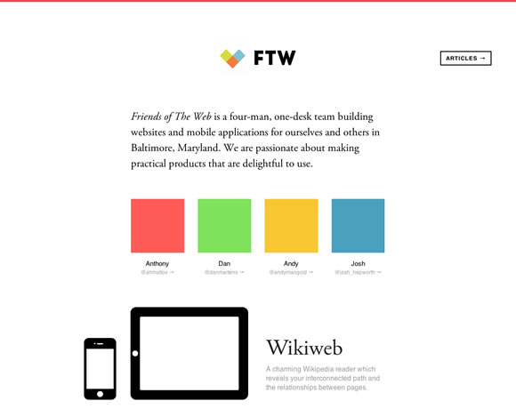
Friends of the Web
Etch
Crafting Type
vtcreative
Flaticons
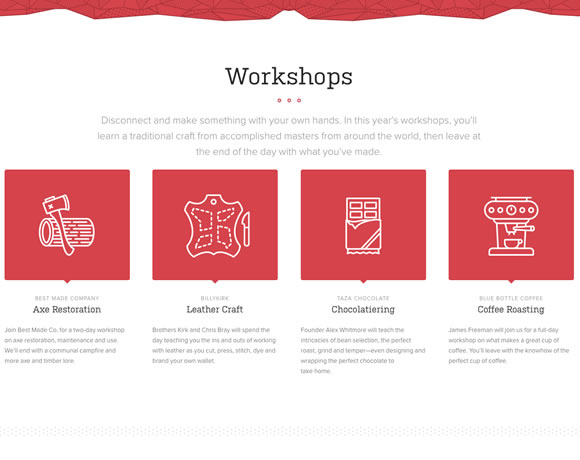
Build 2012
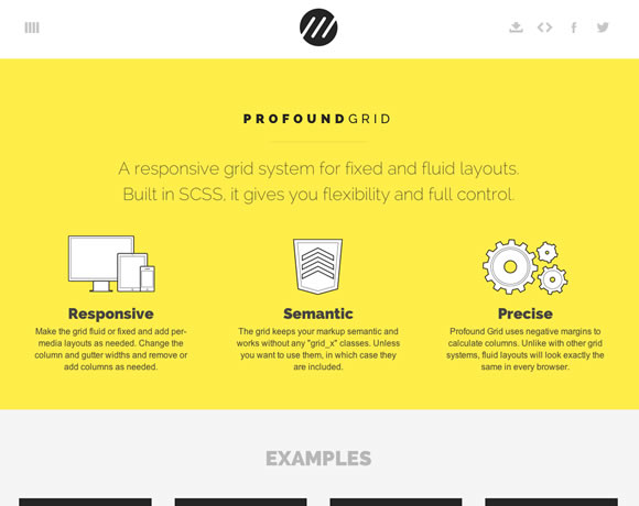
Profound Grid
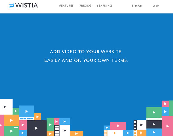
Wistia
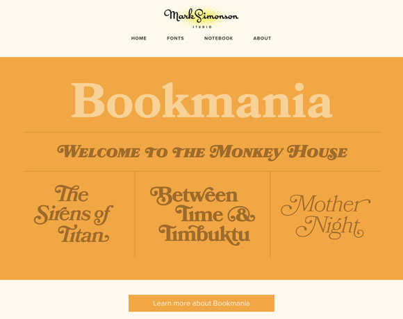
Mark Simonson
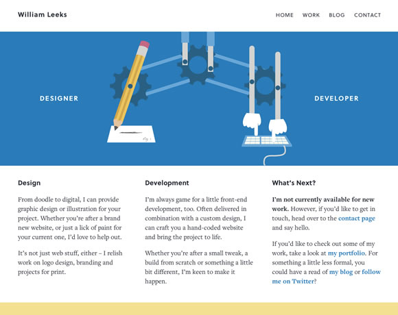
William Leeks
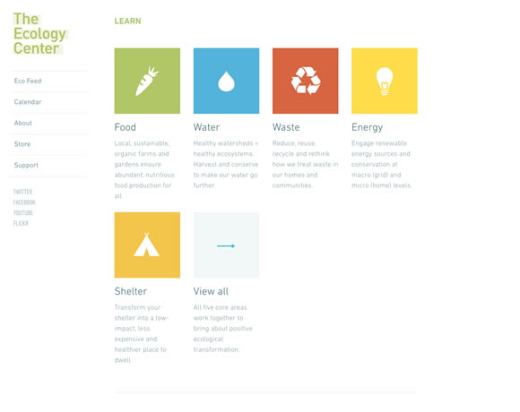
The Ecology Center
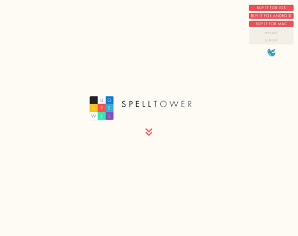
SpellTower
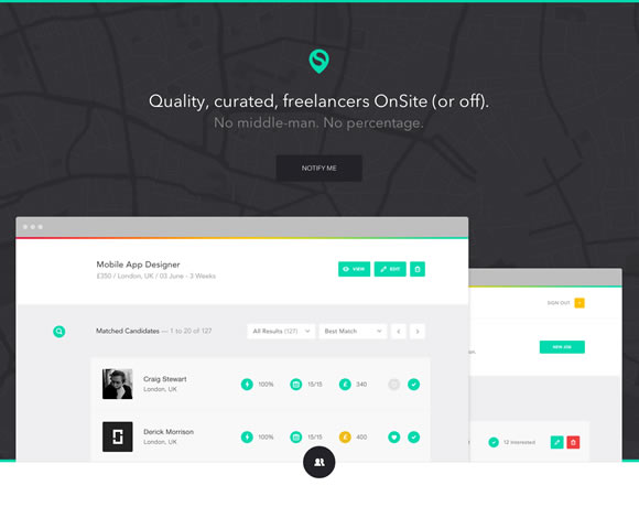
OnSite
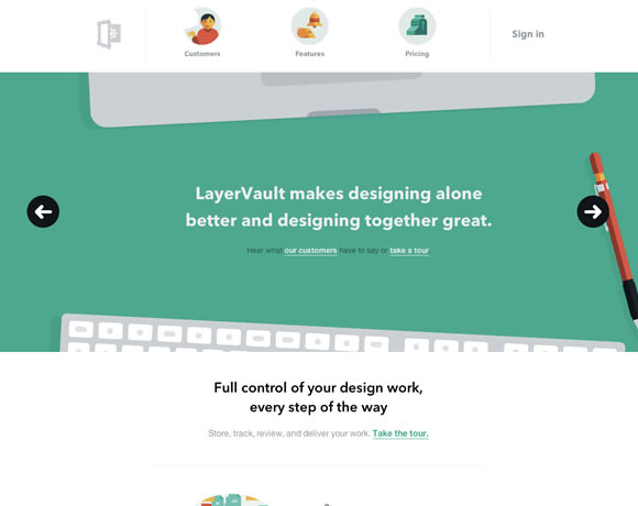
LayerVault
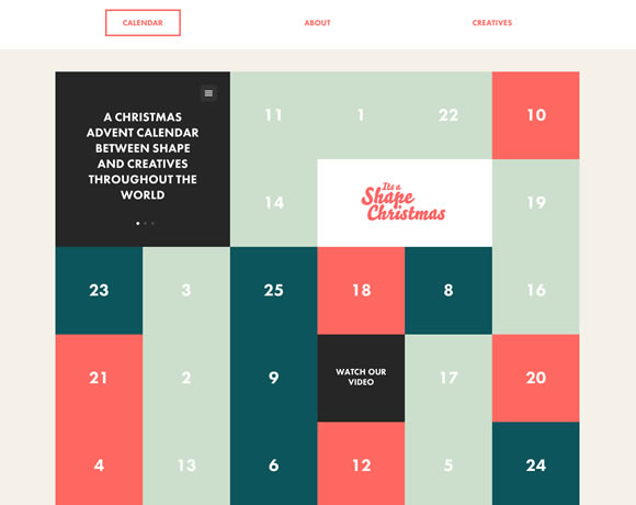
It’s a Shape Christmas
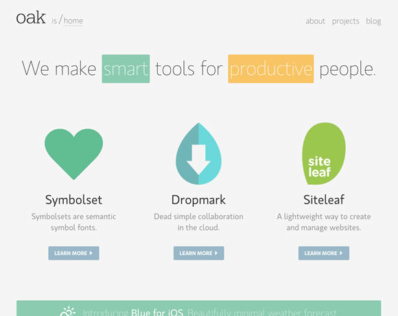
oak.is
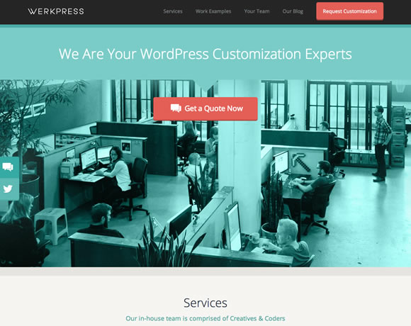
Werkpress
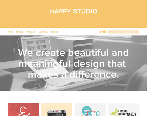
Happy Studio
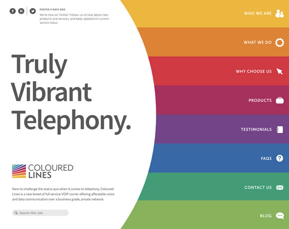
Coloured Lines
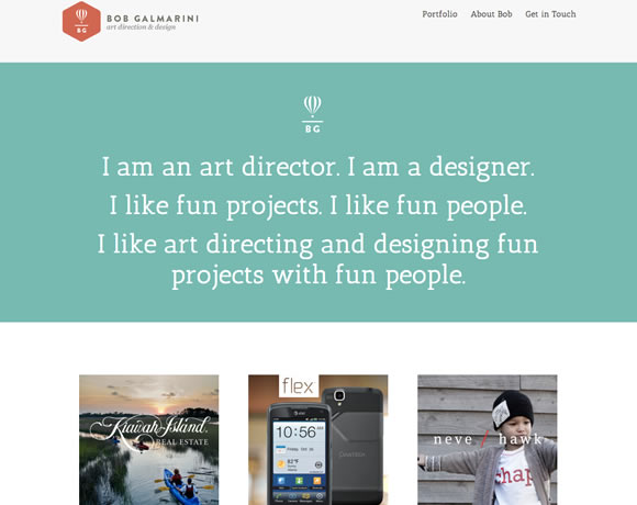
Bob Galmarini
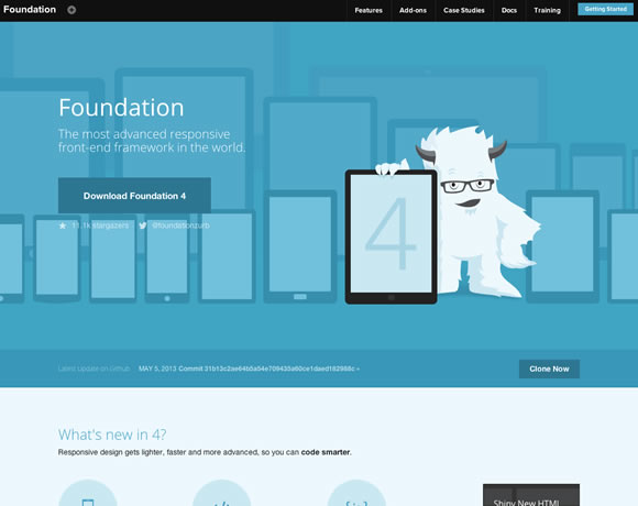
Foundation
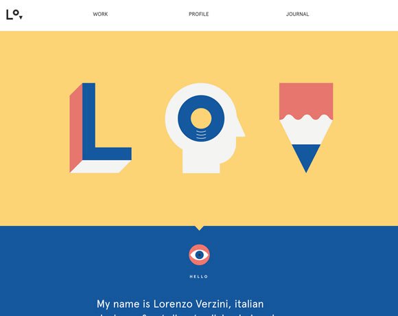
Lorenzo Verzini
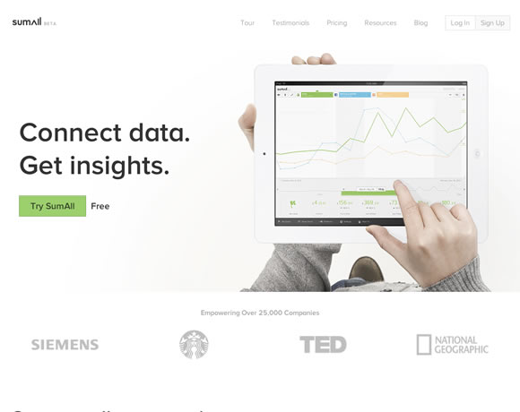
Sumall
You can also find a lot of flat design inspiration on Dribbble, Pinterest and Behance.