What’s new for web designers in Illustrator CC

thumbnailOn May 6th Adobe announced its latest updates to its creative software. Some of these updates have big implications on how users work with their tools. In this article, I’d like to review what Adobe has changed in Illustrator and specifically how it impacts web designers.

Of course there are a several new features, like AutoCAD libraries, white overprint, fill and stroke proxy swap for text, automatic corner generation, indic support, package files, unembed images, multiple file place, touch type tools, free transform tools, and images in brushes. If you’re an Illustrator junkie, these are all worthwhile features, but what I want to focus on specifically are the core improvements that will help anyone creating artwork for on-screen delivery.

HiDPI support

With the emergence of high resolution displays (such as the Macbook Pro with Retina display), Illustrator CS6 and earlier looked blurry. Artwork and icons looked pixelated and text looked anti-aliased. The very nature of Illustrator is provide crisp rich artwork, so this experience was less than desirable. Thankfully Adobe has improved Illustrator CC to take advantage of these high resolution displays. Artwork will look better, text will look crisp, UI elements (icons, cursors, etc) will look smoother. They also made some improvements to the rendering process as well. It now takes advantage of multi-core machines and uses threaded rendering to render artwork. You should see some improvement in tasks like zooming, panning, copy paste, drag and drop, etc.


Guides enhancements

Guides are widely used when planning and laying out pages. Creating mock-ups in Illustrator using guides allow you to place content in a precise manner. In Illustrator CC, there are four enhancements to guides:

  • Double-clicking on a ruler creates a guide at that specific location on the ruler.
  • When you hold Shift and then double-click a specific location on a ruler, the guide created at the point automatically snaps to the closest mark (division) on the ruler.
  • If you hide guides (Ctrl/Cmd + 😉 and then choose to show them, the guides do not get automatically locked like they did in previous versions.
  • Create horizontal and vertical Guides in one action. Here’s how: at the top-left corner of the Illustrator window, click the intersection of the Rulers and press Ctrl (or Cmd on a Mac), and drag the mouse pointer to any location in the Illustrator window; the mouse pointer becomes cross hairs to indicate where a horizontal and vertical guide can be created; release the mouse pointer to create the Guides.


Font search enhancements

The typical type-ahead search only searches the first word in the font name, which generally does not yield the best results immediately. Also, searching and browsing a large number of fonts can be difficult. A new search function option “Search Entire Font Name” has been added to the control and character panels. Additionally, TypeKit integration for desktop fonts was recently announced at MAX. This means you can easily design mock-ups using the same fonts you intend to use on the web.

Whats new for web designers in Illustrator CC


Color search enhancements

Finding a particular color from a range of numerous colors can be time-consuming and frustrating. In Illustrator CC, changes have been made to make the task of searching and finding a color much easier. The Color Picker dialog box (double-click the Fill proxy in the toolbar) now has a search widget in the Color Swatches window. When you click Color Swatches, a search bar appears below the predefined list of colors. Type the name of a color or an RGB value (or CMYK for print). If you type ‘blue’, all the color swatches with the word blue in their name are displayed. Typing R=77 will display all the color swatches that have red color with a value of 77 in the RGB scale. The search widget is enabled by default.

The search option in the Swatches Panel has been enhanced as well. The field does not enforce an auto complete. The characters you type are no longer automatically substituted with the closest color match found. You can type a name of a color, or simply type in the RGB color (or CMYK for print) values to search if such a color combination exists. The Find Field is not enabled by default, and must be enabled for the first time from the panel’s sub-menu.

It’s also worth noting that Kuler has been baked into Illustrator. So if you use this Adobe service to create color themes and groups, you can easily access this content directly inside of Illustrator CC.


CSS properties panel

Of course, the biggest feature for the web are the improvements made to CSS and SVG workflows. Now if you’re a hardcore Illustrator user, you may have used something in CS5 called the HTML5 pack, which was available from AdobeLabs. For whatever reason it never appeared in CS6 but, many of those features have returned with this CC update. These features are reminiscent of what’s already been made available to Photoshop CS6 through Creative Cloud updates and features found in Fireworks CS6.

The CSS Properties Panel is how you’ll extract the CSS from the Illustrator document, and it provides several ways to do that. The key step in making all this work however is by naming your layers within the layers panel. Certainly Illustrator can generate CSS without the object having a name within the layers panel, but you’re opening yourself up to a disorganized and potentially sloppy way of generating code. This is essentially how Illustrator will name the class rules it creates for you. The CSS that is generated can have browser prefixes for Webkit, Firefox, Opera, and Internet Explorer. It can capture CSS supported appearances like gradients and rounded corners.

Whats new for web designers in Illustrator CC

You can control how the CSS is generated by accessing the CSS Export Options dialog box. You can access the dialog box clicking the CSS Export Options button, which is the first of four buttons towards the bottom right of the panel. The panel provides several functions for CSS workflows:

  • View the CSS for a selected object
  • Copy CSS code for a selected object
  • Export selected object to a CSS file along with images used in CSS
  • Export CSS code for all objects in the document to a CSS file

Additionally, you can export the CSS code for all the objects within the document by going to the File menu and selecting Export. That will open a dialog box, and from there you can choose CSS from the format menu.

If you have an object, select it, and make sure it’s named properly in the Layers Panel. With it selected you will see the CSS needed to generate the artwork in a browser in the CSS Properties Panel.


SVG code

In earlier versions of Illustrator, you would have to save a document out as SVG. Here in the CC update you have the ability to copy something within the document, then go to your favorite HTML editor and simply perform a paste; all the SVG code will be placed within the document. It’s a surprisingly nice workflow. If that doesn’t cut it for you, the more traditional method of saving the document as an SVG is still available.

Additionally, Adobe has added support for exporting unused styles. When designing, you’ll often times create multiple graphic styles while creating artwork. You may not use all available styles. When you export artwork in SVG format, unused styles are not exported. Also, in the exported CSS code, graphic styles do not have names associated with them and it may be difficult to identify the right graphic style.

Illustrator CC offers two features have been added to enhance the experience of working with styles in SVG format that address these issues:

  • Graphic style name. When you choose to export graphic styles, the name of each style is exported with the definition of the style in CSS nomenclature.
  • Export unused styles. When you export artwork in SVG format, you may now choose to export unused styles. This allows another designer or developer who is importing the styles to use the unused graphic styles in other pieces of artwork.

Whats new for web designers in Illustrator CC


How you’ll use it

This certainly isn’t a tool to code complete web pages. What I see is using Illustrator to create mock-ups, then hand code the structure in HTML and the layout code in CSS. When a drop shadow, gradient, pattern, or even logo is needed, using these new CSS extraction and SVG options will come in very handy and be a big time saver.

If you’re interested in learning more about the new features in Illustrator CC, visit the Illustrator product page.


Are you an Illustrator aficionado? What features of Illustrator CC are you most excited about? Let us know in the comments.

Gorgeous Premium WordPress Theme Bundle – only $19!
Whats new for web designers in Illustrator CC

Source

Posted in Blog | Comments Off on What’s new for web designers in Illustrator CC

Interview with Grzegorz Domaradzki aka. Gabz

Interview with Grzegorz Domaradzki aka. Gabz

If you’re updated with the digital art world you certainly already know the illustrator and designer Gabz, we featured his artworks several times on Abduzeedo. Today we’re lucky and glad to receive this written interview with him, hope you guys enjoy it.

You can see more from Gabz on the following links:

Website

Behance

Facebook

1) First of all I would like to thank you for doing this interview, it’s an honor for us to present more about you to our readers. I would like to start asking you about when your interest for illustration and art started?

I’m the one who should thank for the interest in interviewing me. I’m that type of guy, or a geek if you prefer, that always was very much into drawing and basically everything image related, so it’s hard to point out a particular moment when it all started… To make things easier, I can say that I started thinking about doing this for the rest of my life somewhere around the end of primary school.

I knew by then I had some unpolished talent and that it wouldn’t be smart to waste it. I was very much into comics back then. Well I still am. Later in high school I discovered Renaissance and other all time masters and knew exactly what I wanted to do in future. Then came Academy of Fine Arts in my home town Poznan where I did my first steps in printing techniques such as dry point, linocut, serigraphy among others, and mediums like painting, sculpture, book illustration, poster and so on. I guess you can say “the rest is history”:)

2) Which artists do you use as reference?

There is quite a number of artists, designers and finally design studios I follow. I believe one cannot really improve without looking up into people whose work you appreciate and admire. Getting more and more involved in poster print community, I have a huge respect for Martin Ansin’s work among many other great artists (Tyler Stout, Jay Shaw and more). His style, compositions and approach to both detail and typography is highly inspiring. Other great illustrators I greatly enjoy are Jesse Auersalo, Von, Mario Hugo, MVM and Alex Trochut to name the few. They are all original in their own way, constantly producing great and inspiring stuff. Hats off to these guys!

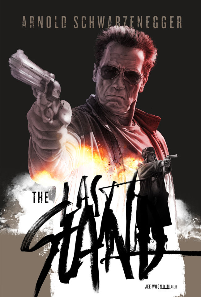
3) Your style is quite influenced by movie posters and realism. How did you develop this style and how would you describe it?

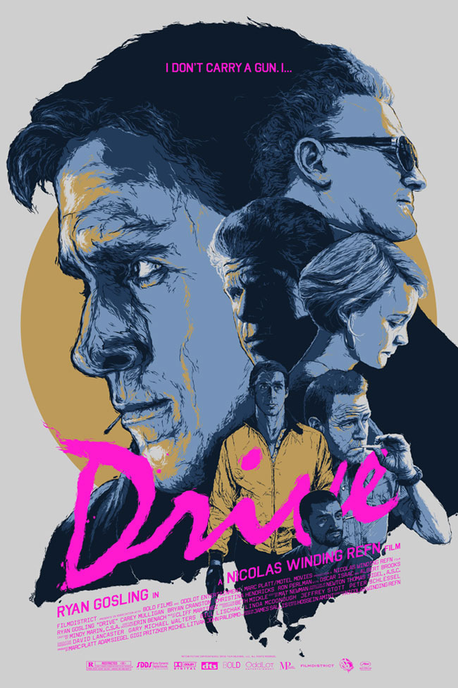
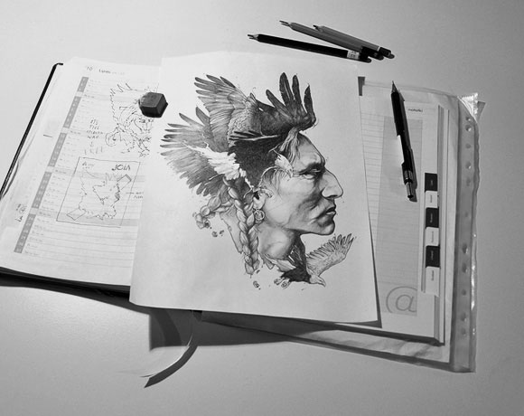
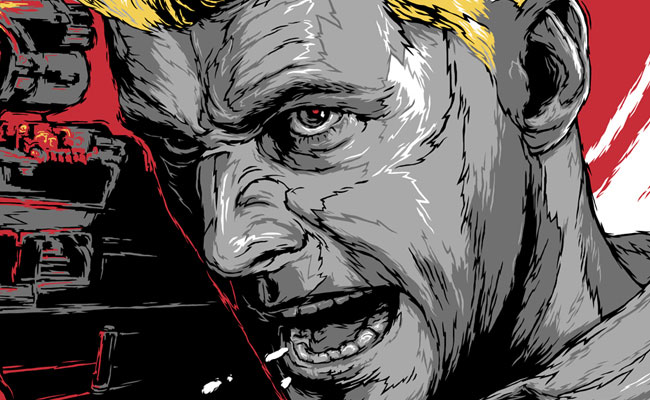
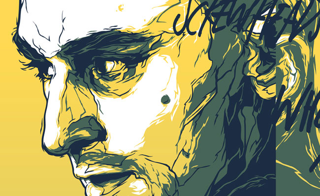
Indeed, I’m very much into realism and figuration in general. If you mean the style I use in the poster prints I produce: it all started with some experiments I did in Illustrator using Pencil Tool. I discovered that spontaneously created shapes over the reverence photograph found on the web, can give some really rich and original effects.

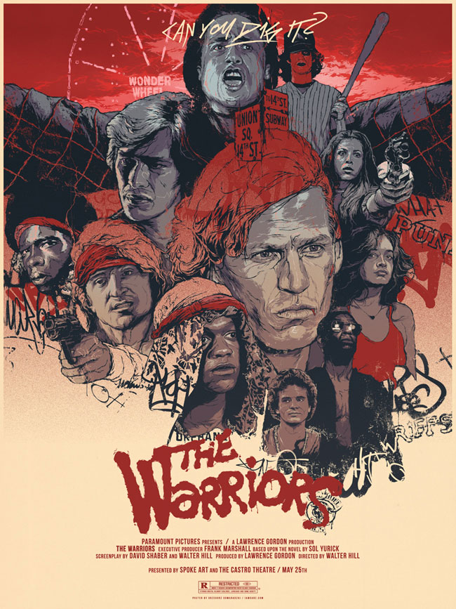
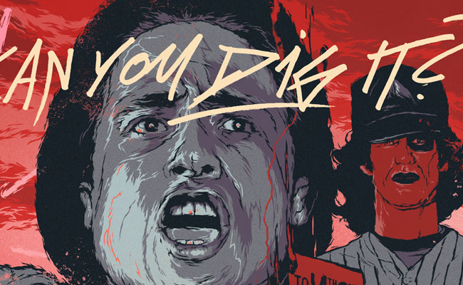
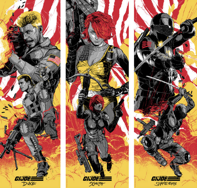
It was in 2008 when I created a personal project titled Vector Movie Posters, which was the first time I have officially used those vector based portraits while creating a series of posters for my favorite movies. Luckily, it got recognized and people seemed to like what I did there. Two years later a gave the project a second go, with the style being more polished and detailed, and the posters much more thought through.

Some time later I have quit using Illustrator and started using Lasso Tool in Photoshop instead, which made creating highly complexed artworks easier and more efficient. Recently I have been developing yet another adjustment to this style by applying dissolved gradients among some simplification to the main line work. I hope I’m moving the right way…

4) Describe us a bit about your creative process while creating a piece.

Collecting some reference pictures and ideas is always a good start. When it is a movie related artwork, I do browse search for images related to the particular title, including main characters and often huge number of screen grabs I find a possible perfect fit for the later artwork. It wouldn’t be much though if I didn’t make some rough sketches and initial concepts first. They are usually highly simplified and not really worth sharing I’m afraid. I then bring the process to Photoshop where I try to make the digital sketch as attractive and finished-looking as a sketch can be.

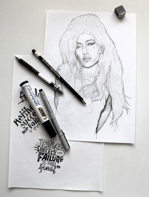
Only when I feel the sketch is looking sharp and original I send it to the client for approval and proceed with the finalization. The delivery process depends on the technique, while the pencil based artworks may seem time absorbing, in fact come to life in a week or so, those that are to be screen printed and need a color separation may take up to 3 weeks tops. Final typography treatment always come at the very end, and includes either browsing through the font library and picking a perfect fit or designing a custom font from the scratch. It’s the hardest part of creating process for me and I often catch myself on regretting not having spend more time on that or doing stuff differently.

5)What’s the best thing about working with illustration and what is the worst?

In illustration only the subject if commissioned and your imagination is the limit. There is nothing else between you an an empty sheet of paper or your screen canvas. You can stick to one or mix styles and mediums. Create abstract or realistic forms, or do both at a time. Create simple or complex compositions, by combining different elements and applying digital objects. Play with plenty of colors, or use a monochromatic palette. I mean what’s here to hate?

6) How do you describe your daily routine? Do you have any hobbies?

My daily routine isn’t anything special I suppose. I start off by browsing through sites that inspire me. Then I answer all emails and start the work, which includes either sketching or finalizing ongoing projects. With a lunch break in between I work up to 10 hours per day usually, though tight timeline commissions do happen every now and then. If necessary, I don’t have any problems with working very long hours.

When the work is done, I try to spend as much time as possible with my wife or my family and friends. Cinema and basically movies are on my priority list, when it comes to what I enjoy doing in a free time. But I also find time for reading and occasional live concerts. Finally, I feel obliged to mention my slight gaming addiction: I highly enjoy playing first person shooter games on PS3.

7) You’re a multimedia artist, but talking about techniques, what is your favorite so far?

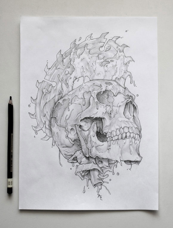
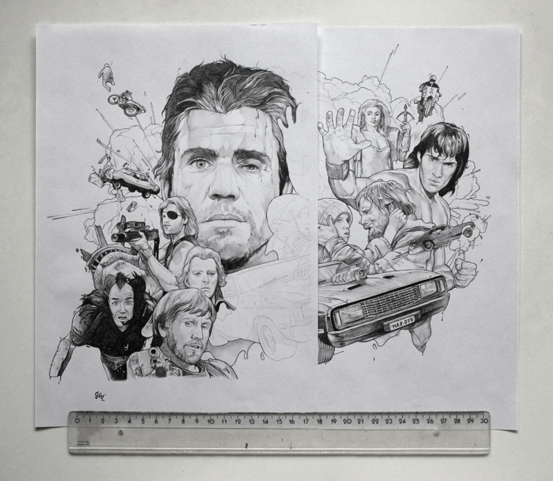
I do operate in various mediums ranging from pencil and acrylic paint for example to fully digital or vector based artworks. But I can easily name two styles that I find most enjoyable for me at this point. First one would be a mix of traditional pencil drawing with digital remastering, including coloring, filters, textures and all sort of other effects applied in Adobe Photoshop.My second favorite style is precisely described above.

8) Tell us five lessons you believe are really important for every illustrator.

These tips are pretty similar for all creative fields and I know I’m not discovering anything new here. Here goes:

1 – Stay inspired! Follow other peoples work, experiment, learn and improve your skills wether in traditional or digital mediums you’re using.

2 – Try working only on the projects that excite you and allow you to improve your skills and push forward. Your work will be just as good as how you feel about doing it.

3 – Don’t try to be good at something… try to be the best! Instead of doing a lot of different things unremarkably, stick or find that one or those few that you rock in.

4 – Let the world see you – create a simple and user friendly online portfolio with selection of works that you find best – After all, you want your future clients to see only the works that you are truly proud of!

5 – Work hard. Cause hard work pays off. Period.

9) Tell us five websites that you like to visit

I visit plenty of sites daily, among those viewed randomly, there are at least a couple I visit everyday:

1 – Ffffound – Site with loads of new images added everyday is a huge inspirational boost.

2 – September Industry – Unfortunately this site is no longer updated as frequently as it was, but it still remains one of my all time favorite when it comes to graphic design inspiration sites! Brilliant selection of projects, studios and graphic designers all around with an easy to find sections on top of that.

3 – It’s Nice That – Design blog, with interesting news from design/art community and often great selection of artists to follow.

4 – Expresso Beans – Though in my opinion this site isn’t really an example of a strong web design, I still visit this one pretty often: Mainly, to keep up with the newest trends in the so called poster community and of course to know what other artists produce. I have been following some of them for a while now. All members are allowed to comment newest releases, so it’s also pretty interesting to know the feedback form art collectors.

5 – Last but not least, one of my favorite agencies Hort. Ok, so I do not visit their site everyday, nor they need any more recognition, but I just love what these guys do and how they manage to combine creative freedom with client guidelines and expectations, and in the end, deliver brave, strong and awesomely executed stuff.

10) Thanks again for your time, please leave a final message for the ones who are starting out on this kind of business.

Summing up: Stay inspired, experiment, always improve, work hard, share your work and good luck!

Posted in Blog | Comments Off on Interview with Grzegorz Domaradzki aka. Gabz